Choose art for your room
Color, mood & interiors
Color does not carry one fixed emotional meaning into every room. Light, surrounding materials, value, saturation, proportion, composition, and scale change what a print does. Use this hub to make those variables visible before you try to match a swatch or assign a mood word.
4 practical guides · Updated July 14, 2026
The room-first sequence
Make five decisions in this order
This order prevents a common mistake: choosing a print from its dominant hue alone, then discovering that its contrast, intensity, or scale fights the room.
- 01
Light & materials
Observe the wall in daylight and after dark. Note bulb temperature, window direction, paint undertone, wood, stone, metal, upholstery, and large textiles. These conditions change the appearance of every color placed beside them.
- 02
Value
Decide how light or dark the artwork should read against the wall and furniture. Value contrast determines presence at a distance before subtle hue relationships become visible.
- 03
Temperature
Compare colors relationally: a blue can lean warmer beside green and cooler beside violet. Decide whether the artwork should repeat the room's temperature, bridge warm and cool materials, or create a deliberate counterpoint.
- 04
Saturation
Choose how intense or muted the color should be. A small saturated accent can focus the eye; a large high-chroma field can dominate. Muted does not automatically mean calm, and bright does not automatically mean energetic.
- 05
Composition & scale
Read where the dark masses, active marks, focal points, and empty areas sit, then size the piece for the wall. The same palette can feel open, compressed, balanced, or restless depending on arrangement and physical presence.
Why this avoids color-psychology shortcuts
Mood is a reading of relationships, not a property of one hue
“Blue is calming” and “red is energizing” are too universal to guide a real purchase. A pale, low-contrast blue field can feel expansive; a dense cobalt with sharp black diagonals can feel urgent. A dusty red may recede in warm evening light, while a small high-chroma red mark can become the strongest focal point in a neutral print.
Cultural association, memory, subject matter, and the room's use also matter. PosterBloom's mood labels are therefore curatorial descriptions of a complete work, not guaranteed psychological effects.
Learn more
Explore color, mood & room decisions
Each guide isolates one decision, then reconnects it to the room. Use them together: theory supplies vocabulary; the room-palette guide supplies observation; the temperature and mood guides test the interaction.
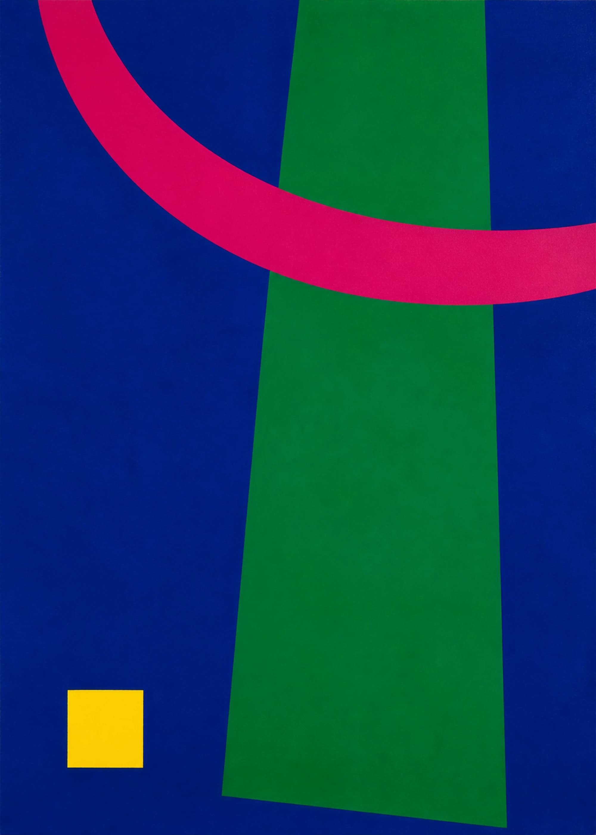 Color Theory for Wall Art and InteriorsUse hue, value, saturation, contrast, and color proportion to choose wall art that works with a room—without relying on rigid color-wheel formulas.10 min read · 4 sources · Color theory, interior palettes, color contrast
 How to Choose Art for Your Room PaletteChoose wall art by reading undertone, value, saturation, proportion, and room light—then decide whether the work should repeat, bridge, or deliberately challenge the palette.10 min read · 3 sources · Room palettes, material undertones, room lighting
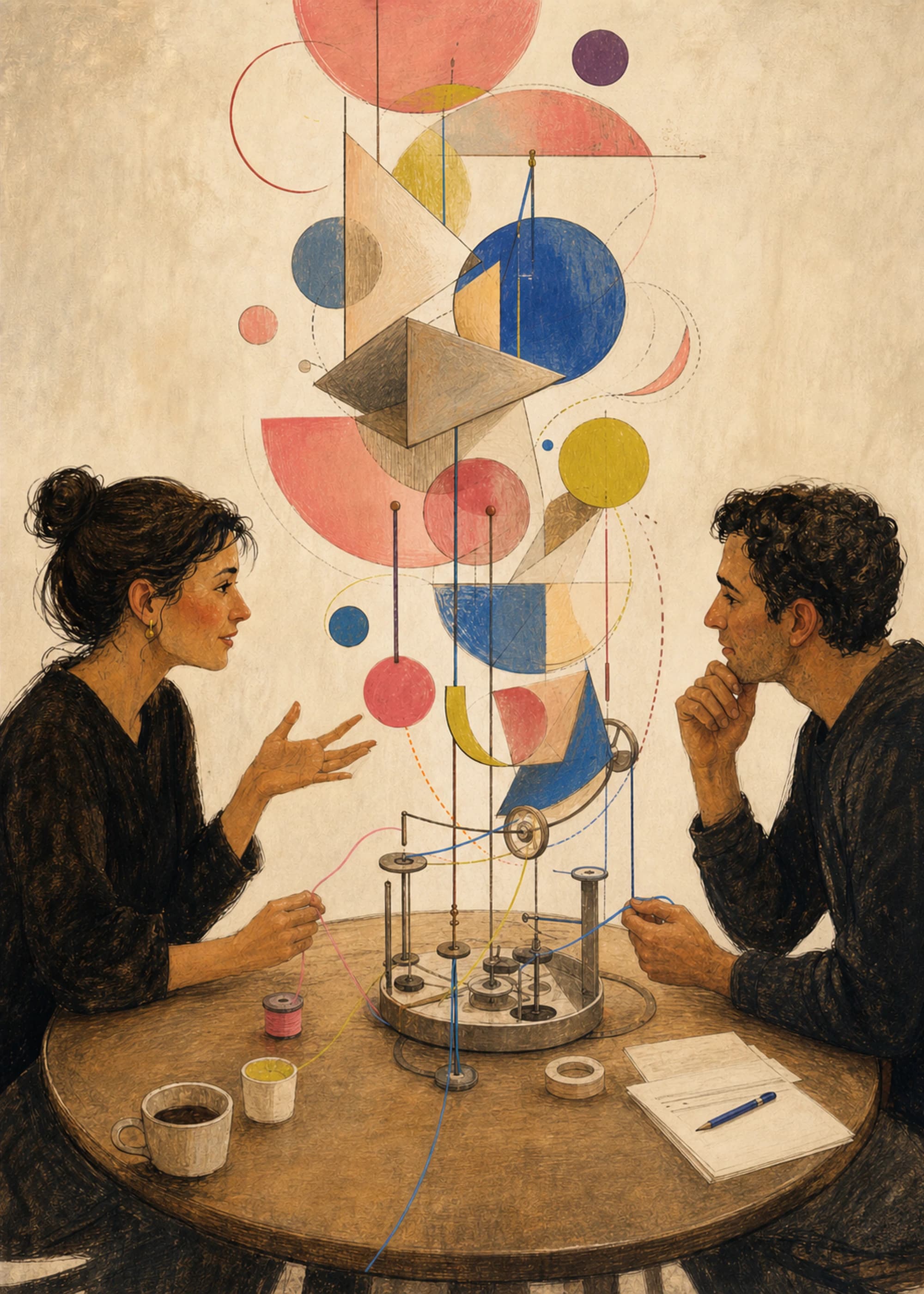 Warm vs. Cool Colors in Wall Art: A Relative, Practical GuideUnderstand why color temperature is relative, how warm and cool relationships change depth and emphasis, and how room light and surrounding materials alter what you see.10 min read · 4 sources · Color temperature, warm colors, cool colors
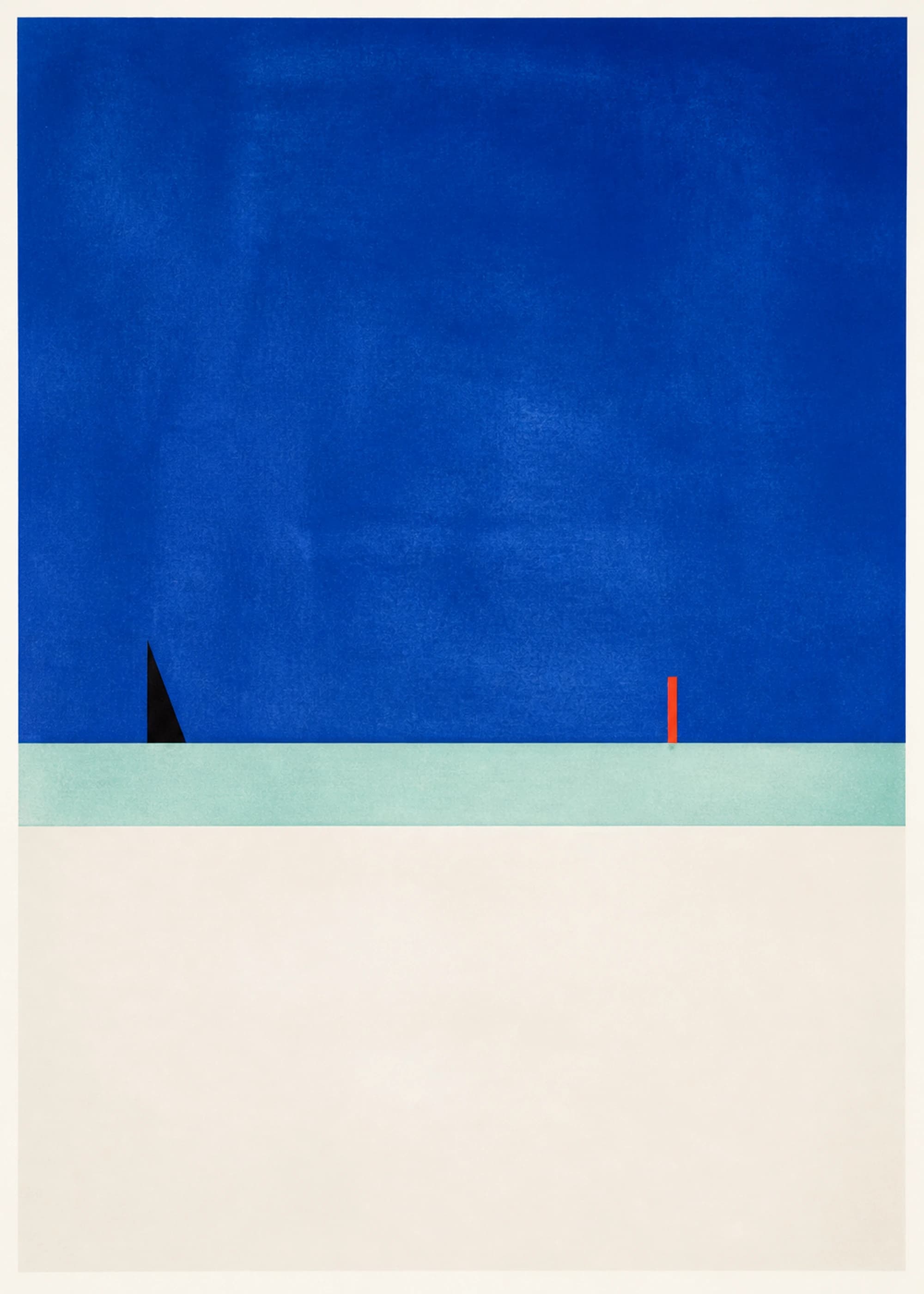 How Color and Composition Change a Room’s MoodUse value, saturation, scale, density, rhythm, and negative space to predict how wall art may change a room—without relying on universal color-psychology claims.11 min read · 4 sources · Room mood, value and saturation, composition
Move from reading to choosing
Browse by relationship—not by a promised emotion
The color and room edits below are built from active catalog taxonomy and curated product sets. Use them to compare palettes in context; then check the full artwork, dimensions, and frame rather than treating the category name as the decision.
- Living Room Wall Art8 curated prints
- Blue Wall Art Prints8 curated prints
- Green Wall Art Prints8 curated prints
- Terracotta and Earth-Tone Wall Art8 curated prints
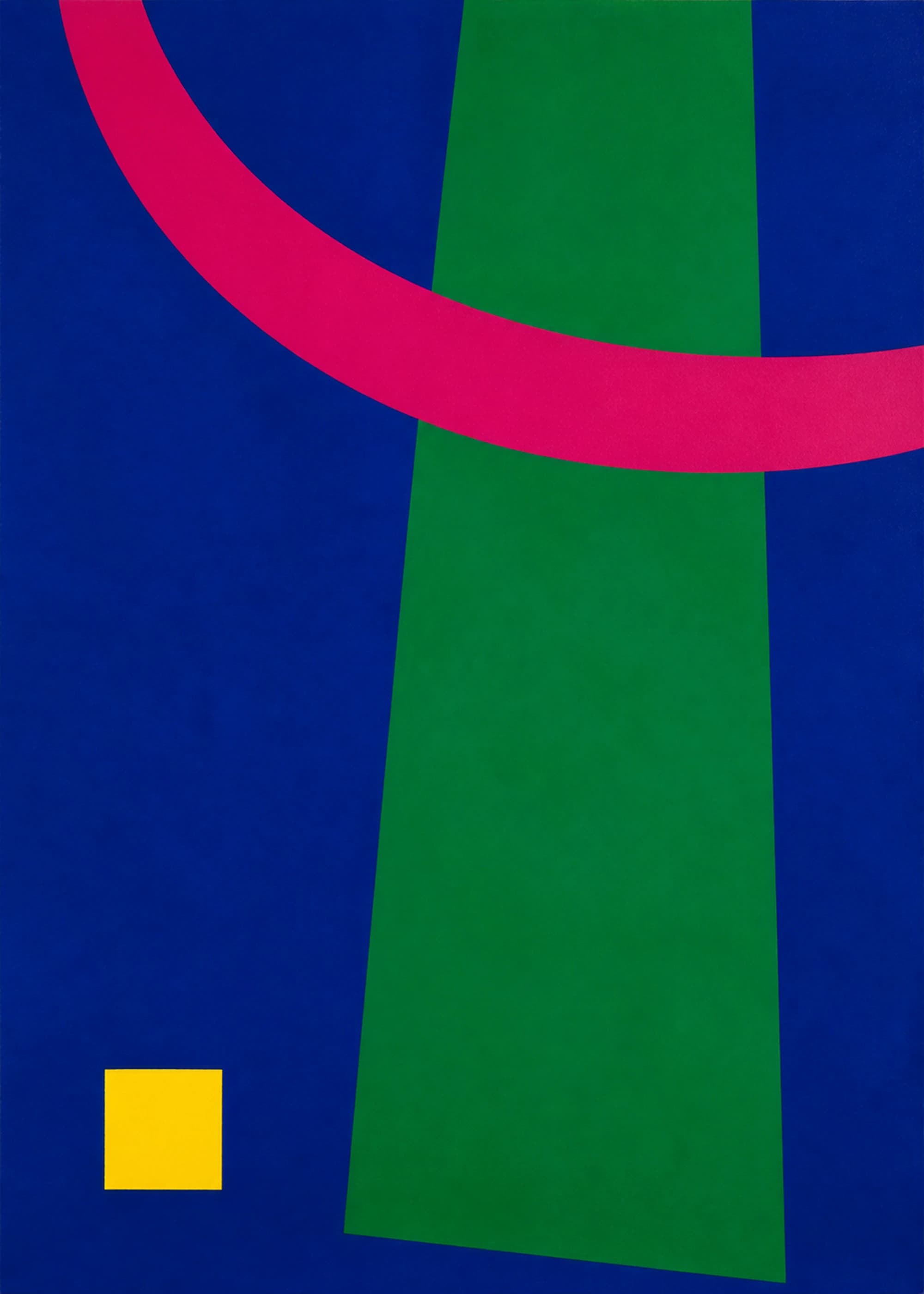
Electric Color Field
Electric Color Field
- ultramarine
- emerald
- magenta
From $42
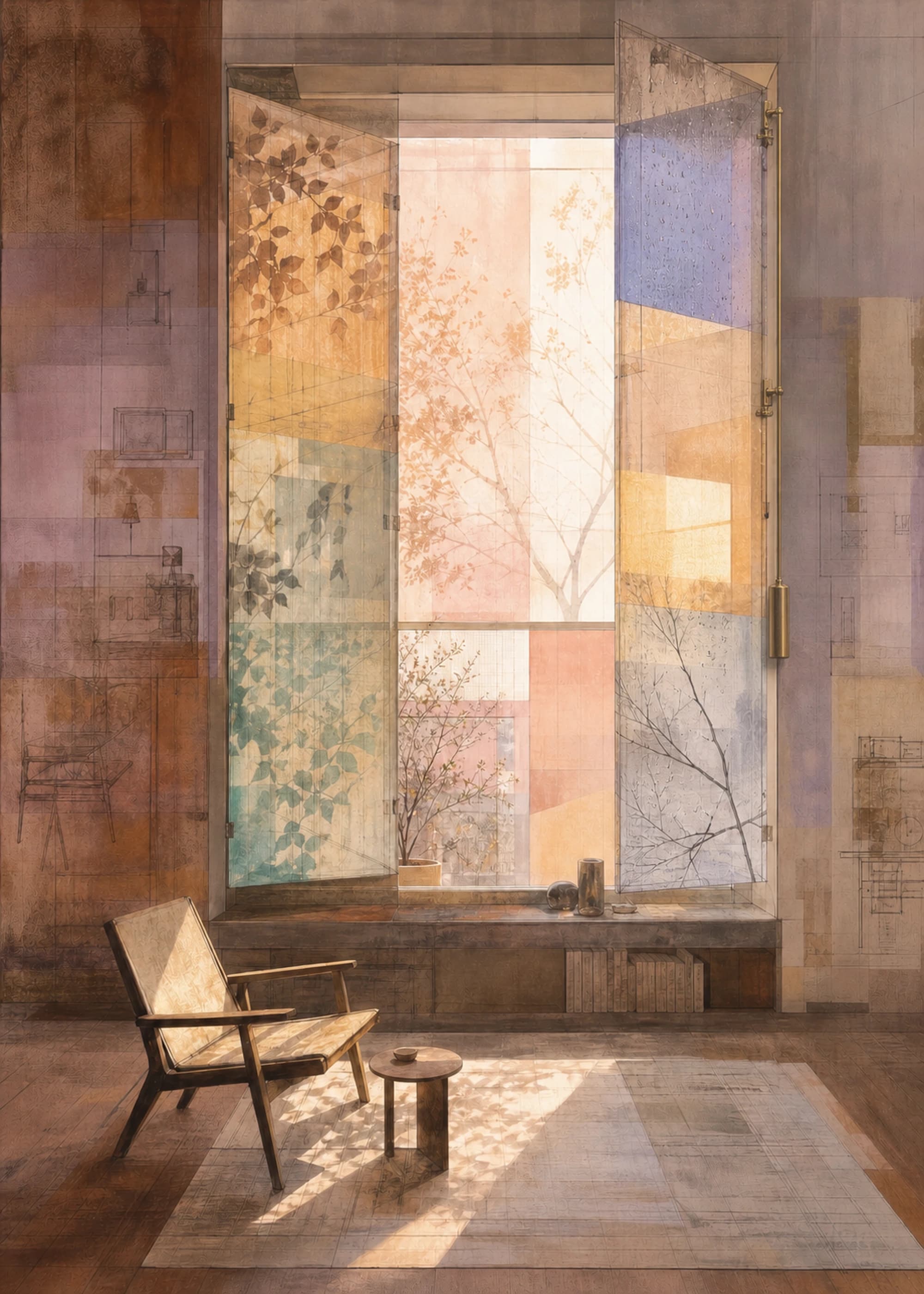
A Window That Remembers — Hinge Study
Soft Systems
- burnt umber
- warm white
- smoky lavender
From $42
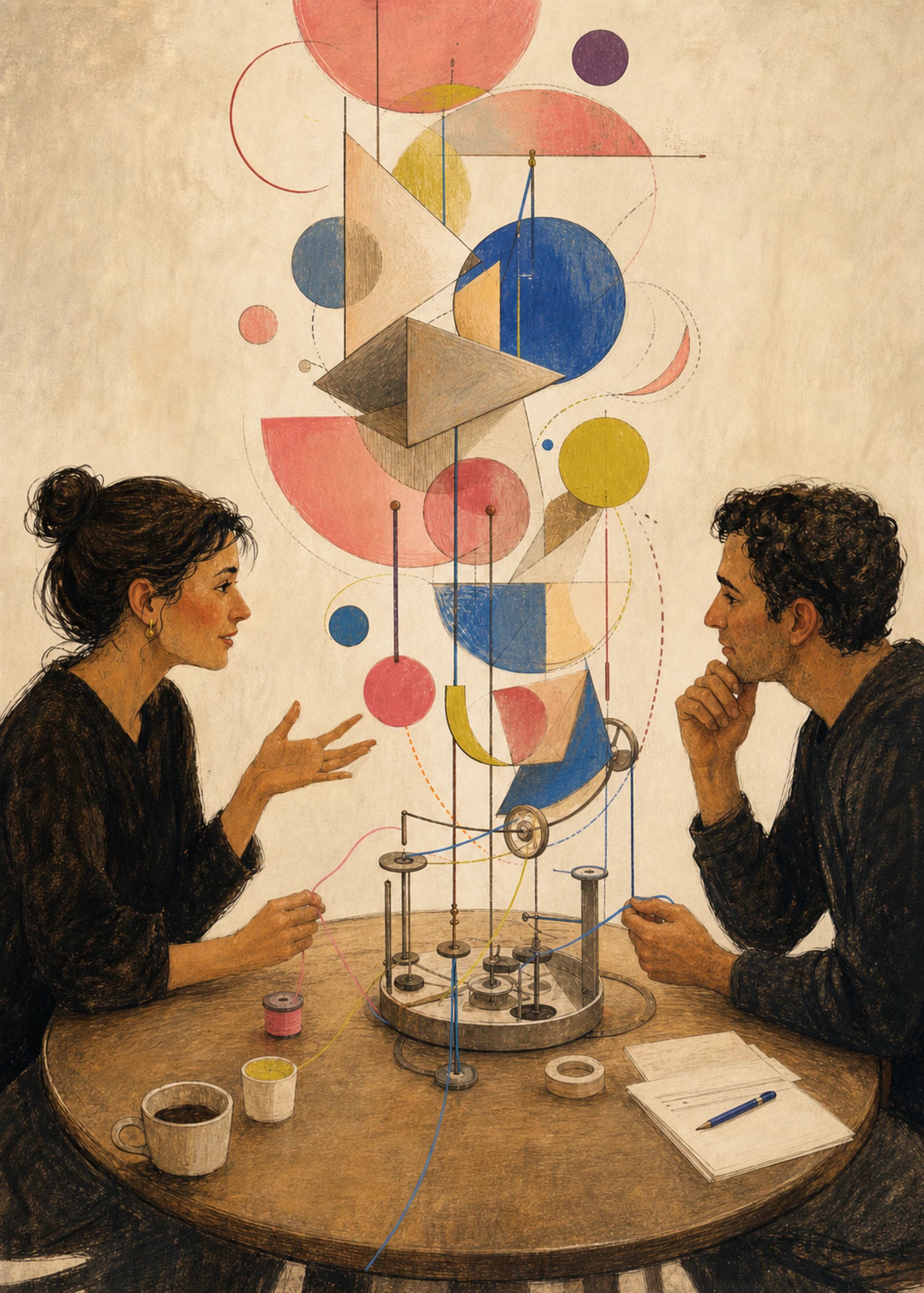
Conversation Engine — Hero Study
Soft Systems
- espresso
- parchment
- coral pink
From $42
Need a broader starting point? Browse wall art by room, style, and palette or see every active print.