Art literacy guide
Warm vs. cool colors in wall art
Understand why color temperature is relative, how warm and cool relationships change depth and emphasis, and how room light and surrounding materials alter what you see.
PosterBloom guide · 10 min read · Updated Jul 14, 2026
The useful version
Temperature is a comparison, not a property stamped onto a color forever. Identify the warmest and coolest notes inside the artwork, compare them with the room's neutrals, and test the relationship in daylight and under the lamps you use. Mixed-temperature art is often the most adaptable.
The familiar rule is only a starting point
Introductory color systems commonly group reds, oranges, and yellows as warm, and blues, blue-greens, and blue-violets as cool. The National Gallery of Art uses that convention to teach how warm colors can appear to project while cool colors can appear to recede. It is a useful first map, not a verdict on every room or artwork.
Within any hue family, temperature remains relative. A crimson can look cool beside tomato red and warm beside violet. A turquoise can look warm beside cobalt and cool beside yellow-green. Josef Albers's teaching centered on this kind of interaction: neighboring colors change what we perceive.
Describe the comparison you can see. “This blue is the coolest note in the print” is more useful than “blue is cool.” It keeps the decision connected to the actual artwork and leaves room for light, material, proportion, and context to change the result.
Neutrals set the temperature baseline
White, gray, beige, brown, and black are not outside color. A white may lean blue, pink, yellow, or green. Gray can be violet-gray, green-gray, or brown-gray. Natural oak often reads yellow-orange; walnut may lean red, purple, or gray; concrete can shift from warm taupe to blue-gray.
Those large neutral fields establish the comparison. A blue print on a yellowed plaster wall may appear cooler than it does against a blue-gray wall. A coral accent can warm cool concrete but may merge into terracotta. The frame and mat participate too: warm white paper can soften a cool field, while black can sharpen both temperatures.
Find the baseline
Hold a plain white sheet near the wall, sofa, and largest wood surface. The comparison makes undertones easier to see. You are not looking for a paint-store match—only whether each large field leans warmer, cooler, or nearly balanced beside the same white.
Read temperature at three scales
Dominant field
The color occupying the most area determines the first room-distance impression.
Secondary bridge
A smaller opposing temperature can connect the artwork to furniture or materials.
Accent
A tiny saturated note can command more attention than its area suggests.
Area matters because a work can be predominantly cool without feeling uniformly cold. One coral line inside a cobalt field may organize the whole image. Conversely, several small blue shapes may not outweigh a broad cream or ochre ground.
Value and saturation can overrule the simple temperature reading. A very dark muted blue may act as a heavy anchor; a pale orange may feel airy. A vivid cool color can advance more forcefully than a grayed warm color. Read temperature alongside light–dark contrast and intensity.
A PosterBloom example: Conversation Engine — Hero Study is deliberately mixed
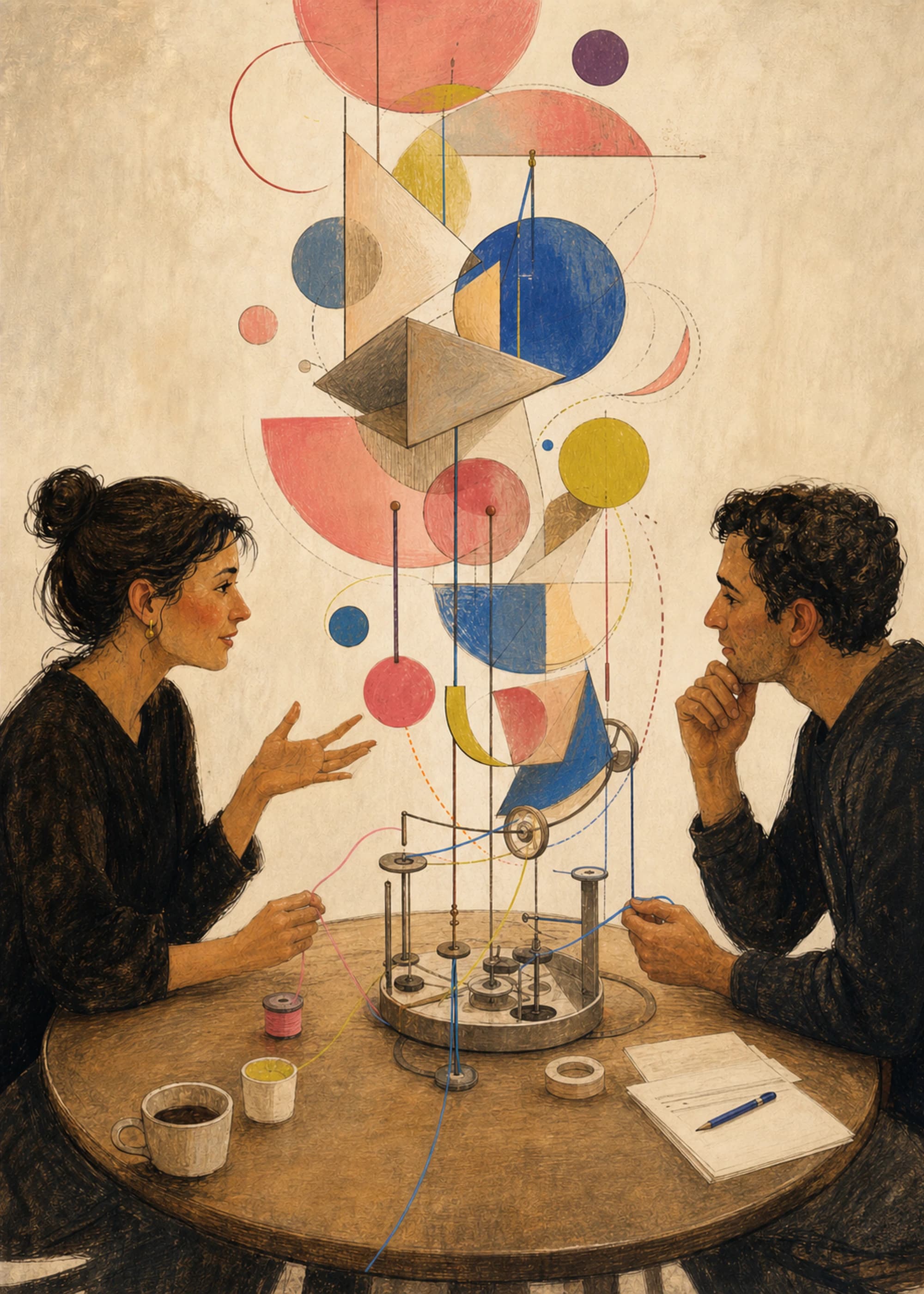
Conversation Engine — Hero Study sets coral pink and citron against cornflower blue and plum, all held by espresso and parchment. It does not ask the room to choose a single temperature. Warm notes can connect with wood, leather, or cream; cool notes can answer blue-gray walls, metal, or shaded daylight.
We curated it for this guide because its temperature relationship is distributed through the composition rather than divided into a warm half and a cool half. The blue circle carries visual weight, coral arcs move through the field, and the parchment ground keeps both families readable. That makes it a better teaching example than a uniformly orange or uniformly blue print.
Compare it with Cobalt Horizon Marker, where a broad cobalt field and pale aqua band make a narrow red-orange marker disproportionately active. Then look at Quiet Load Bearing: warm beige, rust, bone, mineral gray, and black show that even a restrained neutral palette contains temperature differences.
Daylight and lamps can reverse your first impression
Light provides the wavelengths that surfaces reflect to the eye, so changing the source can change the colors you see. Getty research found that incandescent sources weaker in the blue region alter color rendering compared with whiter sources such as daylight; low light also makes dark, low-contrast detail harder to see. Home lamps and windows are not museum test chambers, but the practical lesson transfers: judge art where and when you will live with it.
North-facing or shaded rooms may receive cooler-looking, lower-level daylight. Direct sun changes during the day and can make warm surfaces prominent. In the evening, warm lamps may pull cream, amber, coral, and timber together while reducing separation among some blues and blue-grays. A cooler lamp can do the opposite.
Do not infer a precise result from a bulb's marketing label. Wall color, shade material, lamp position, dimming, and reflected light all intervene. Test a large image of the work in both conditions, and remember that a luminous screen is only a structural preview of a matte physical print.
Four room decisions temperature can support
These are composition strategies, not emotional prescriptions. Warm does not automatically mean welcoming, and cool does not automatically mean calm. A dark red-black work can feel severe; a high-saturation cyan can feel electric. Subject, edge, scale, and personal association all change the reading.
A five-minute temperature test
- Identify the warmest and coolest notes in the artwork. Compare colors inside the image before comparing them with the room.
- Estimate their proportions. Is one a field, one a secondary shape, or one a pin-sized accent?
- Compare both notes with the room's largest neutral. Wall, floor, or upholstery—not a removable cushion—should set the baseline.
- Check daylight and evening light. Watch for lost separation, especially in dark or muted passages.
- State the intended relationship in one sentence. “The blue field counters the oak, while the coral marker connects to it” is a decision you can evaluate.
If you cannot name the relationship, return to the broader color theory guide. Temperature is one control among hue, value, saturation, proportion, and contrast—not a complete room plan by itself.
Keep culture and memory in the picture
The National Museum of Asian Art emphasizes that perceptions of color can be rooted in culture and tradition. Personal memory adds another layer: a particular institutional blue, school color, childhood kitchen yellow, or regional red may carry associations no generic palette system can predict.
Those associations are evidence about your response, not errors to correct. Use warm and cool language to describe visible relationships, then choose the work whose total experience makes sense for the room and the people using it.
Keep exploring
Sources and further reading
Selected sources for further reading. Room and styling recommendations are PosterBloom's editorial guidance.