Art literacy guide
Color theory for wall art and interiors
Use hue, value, saturation, contrast, and color proportion to choose wall art that works with a room—without relying on rigid color-wheel formulas.
PosterBloom guide · 10 min read · Updated Jul 14, 2026
The useful version
Choose color in context. First match the room's light–dark structure, then decide whether the art should repeat, bridge, or interrupt the existing hues. Test the whole relationship at room distance; a color never acts alone.
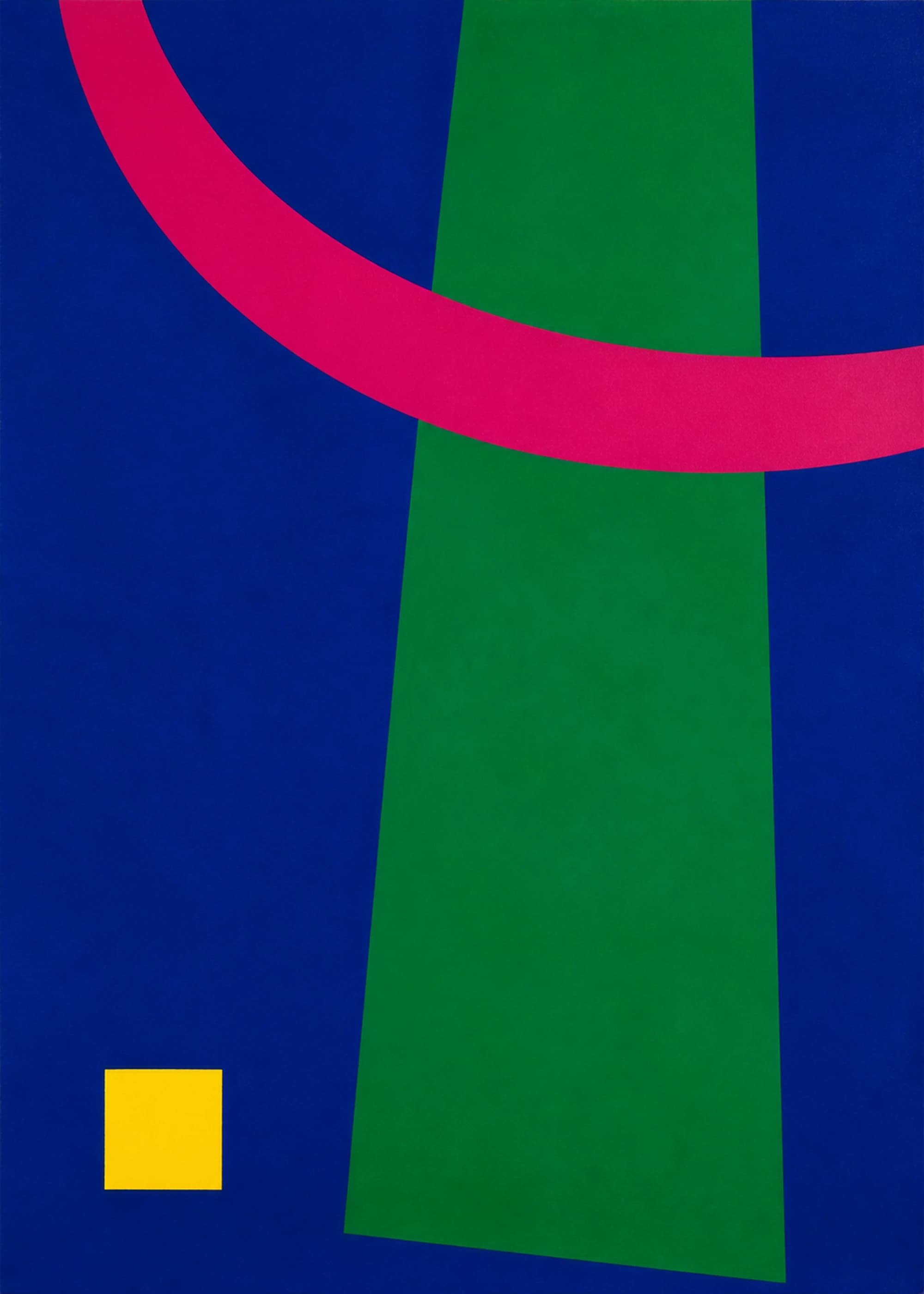
Color is relational
Josef Albers built his color teaching around direct observation rather than a fixed system. The central lesson of Interaction of Coloris that a color's appearance changes with its neighbors. The same patch can seem lighter, darker, warmer, cooler, brighter, duller, larger, or smaller when its surrounding field changes.
This is why matching a print to a paint chip is rarely enough. Wall color, daylight, lamp temperature, frame, mat, nearby textiles, and the proportion of each color all alter the relationship. A muted blue surrounded by cream can become the strongest color in the room; the same blue beside saturated green may recede.
Color wheels remain useful maps, but they do not choose a room for you. The Smithsonian traces centuries of attempts to order color and shows how designers have applied color harmony, contrast, optical effects, and forecasting in real objects and interiors. The practical skill is not memorizing one “correct” scheme. It is learning to observe what colors do together.
The four controls that matter most
Hue
The color family: red, orange, yellow, green, blue, violet, and the many intervals between them. Hue is only the starting coordinate.
Value
How light or dark a color appears. Value creates room-distance hierarchy and often matters more than exact hue.
Saturation
The intensity or chroma of a color. High saturation attracts attention; lower saturation can expand the role of texture and value.
Proportion
How much area a color occupies. A small vivid accent may balance a broad neutral field; equal areas create a different argument.
Texture and finish modify all four. A matte, fibrous surface scatters light differently from a glowing screen or glossy object. Printed ink, paper, wall paint, woven cloth, and lacquer may share a hue name without producing the same visual effect. PosterBloom product images are digital representations of physical prints; screen brightness and room light can change how the delivered color is perceived.
Start with value, because the room sees it first
Squint at the wall or view a phone photo in grayscale. Where are the largest light, middle, and dark zones? A print with a strong dark mass can anchor a pale room. A high-key print can open a dark corner, provided the wall or mat gives its light forms a visible edge. A mid-value work on a similar mid-value wall may lose definition even when the hues differ.
Value also determines distance performance. Fine changes among close values reward nearby viewing; strong light–dark structure remains legible across a room. Above a sofa or bed, test the artwork at the distance from which you normally enter. At a desk or in a hallway, subtler value relationships can invite a slower look.
A fast value test
Take a photo of the room and place a thumbnail of the artwork over the intended wall. Convert the image to grayscale. If the print still establishes the emphasis you want, its value structure works. Return to color only after that test.
Repeat, bridge, or interrupt
These three strategies are more useful than trying to “match the room.”
Repeat
Pick up one existing hue in the artwork: the olive of a chair, rust in a rug, or cobalt in a vase. Let the quantity differ. A small echo feels intentional; equal doses can feel staged.
Bridge
Choose art that contains two colors already separated in the room. A print carrying both warm oak and cool blue can connect furniture and textiles without matching either exactly.
Interrupt
Introduce one color absent from the room. The interruption works when the artwork has enough scale or saturation to look deliberate and the rest of the space gives it room to remain singular.
A neutral room can support any of the three. “Neutral” is not colorless: cream may lean yellow, gray may lean blue or violet, and wood may carry orange, red, green, or gray undertones. Observe those tendencies instead of relying on the label.
Warm and cool are relationships, not permanent identities
Reds, oranges, and yellows are often called warm; blues and blue-greens are often called cool. In practice, one red can look cooler beside an orange-red, and one blue can look warmer beside a greener blue. Light conditions and adjacent materials move the comparison again.
Use temperature to control connection and separation. A warm artwork can bring pale oak and cream forward. A cool work can create distance against terracotta or leather. Mixed-temperature art often bridges a room more easily because one area connects while another provides contrast.
Avoid universal mood claims. Color meanings vary by culture, memory, context, and combination. Blue can feel spacious, electric, solemn, or corporate. Red can feel intimate, urgent, ceremonial, or playful. Describe the actual blue—pale, dark, gray, saturated, green-leaning—and what it does beside the other colors.
Contrast has several dimensions
Complementary pairs—such as blue/orange or red/green—can create vivid contrast, but the effect depends on value, saturation, and area. A dusty blue field with a tiny ochre mark behaves differently from equal blocks of vivid cobalt and orange. Treat complements as one available relationship, not a recipe.
Building a palette across several prints
Do not require every print to contain the same three colors. Instead, create a chain. Print A shares blue with Print B; Print B shares ochre with Print C; consistent frame color gives the whole group a second connection. This produces unity without making the wall look like a product bundle.
Balance saturation across the arrangement. If every piece has one vivid accent, space those accents so they move the eye rather than collect in one corner. If one artwork is much darker, place it low or counter it with another dense element. The gallery wall guide covers spacing and overall layout.
A room-by-room decision method
- 1. Photograph the wall in daylight and at night. Notice which colors shift and which parts of the room go dark.
- 2. Map value before hue. Decide whether the artwork should anchor, open, or blend with the wall.
- 3. Choose repeat, bridge, or interrupt. This gives the color a clear job.
- 4. Check proportion. Compare the artwork's dominant color area with the amount of that color already in the room.
- 5. Test the frame as a color. Black can extend dark structure; oak can bridge warm materials; white can preserve a light boundary.
- 6. Remove one echo. If every cushion, vase, and book repeats the print, take one away. A room needs relationships, not proof that you found the exact swatch.
How PosterBloom describes color and influence
Our color labels are navigation aids, not claims that a work contains one standardized pigment or will look identical in every room. Terms such as blue, terracotta, and green group related visual families; individual product imagery and palette details provide the more specific view.
When a work draws on a historical approach to color—such as modernist reduction or Albers-like attention to interaction—we describe it as influenced by that visual tradition. We do not claim authorship by, affiliation with, or reproduction of work by Josef Albers or any other historical artist. The lesson is a way of looking; the contemporary artwork remains its own work with its own disclosed process.
Keep exploring
Sources and further reading
Selected sources for further reading. Room and styling recommendations are PosterBloom's editorial guidance.