Art literacy guide
How to read composition and mark-making
A plain-language method for reading focal point, balance, rhythm, negative space, line, edge, and mark-making—then using those qualities to choose wall art.
PosterBloom guide · 10 min read · Updated Jul 14, 2026
The useful version
Describe before you interpret. Track where your eye enters, what stops it, how it moves, and which marks make the surface feel controlled, urgent, quiet, rough, or precise. You do not need to guess the artist's intention to make a careful observation.
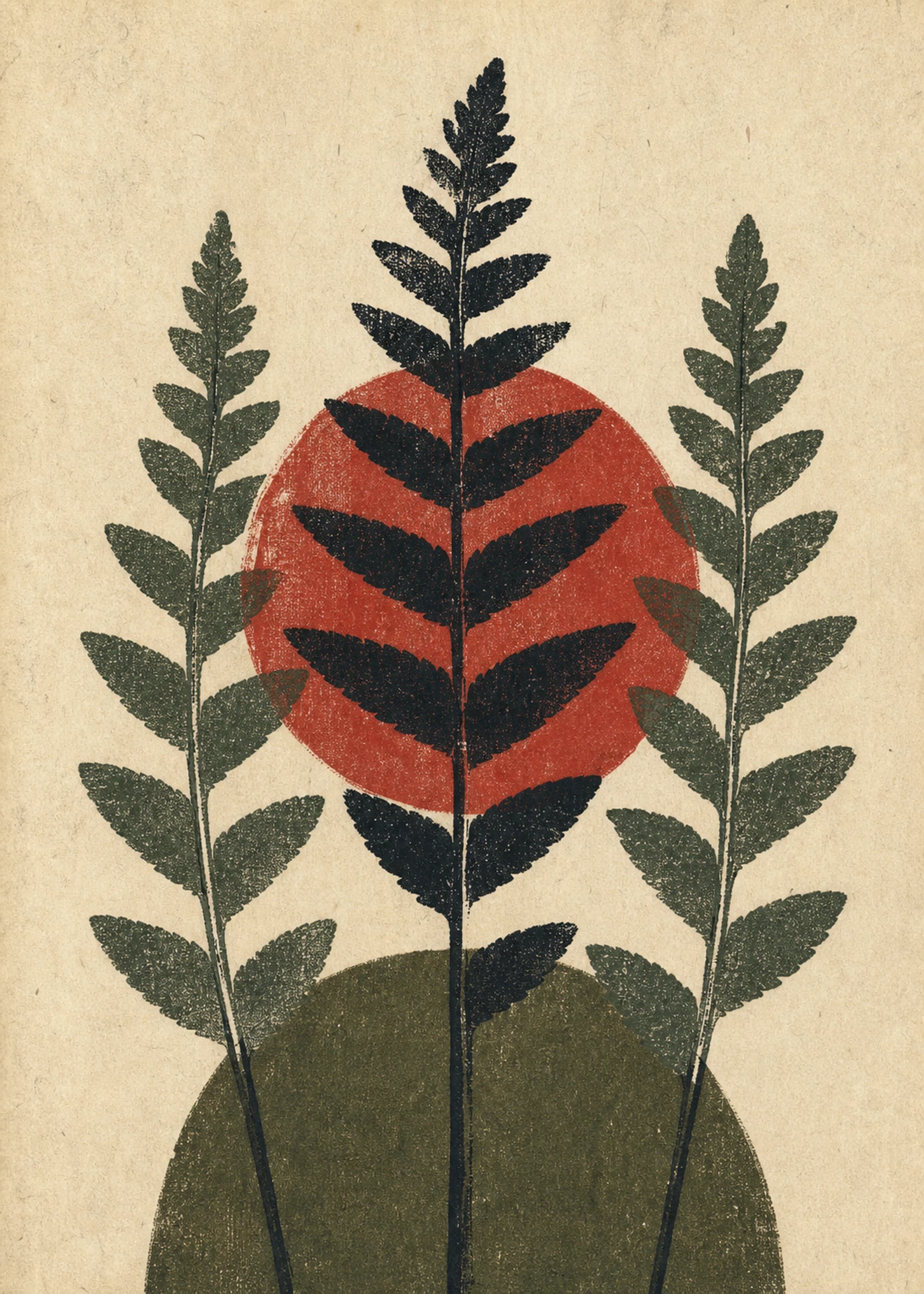
Formal analysis is close looking, not decoding a secret
Formal analysis starts with the observable building blocks of an artwork. The Getty identifies elements such as line, shape, form, space, color, and texture; the National Gallery of Art uses a similar framework to show how artists organize those elements. Composition is the arrangement that makes them act together.
Begin with a visual inventory. Name what is present before deciding what it means: three dark verticals, a pale field, one cropped circle, rough short strokes, a clear center, or no obvious center. MoMA's guidance for looking at art likewise moves from description toward interpretation, asking viewers to notice line, shape, color, composition, material, technique, and subject matter.
This sequence protects you from two common mistakes: assuming every feeling was intended, and using style words as substitutes for seeing. “Calm” becomes more useful when you can say why: low contrast, wide spacing, repeated horizontal lines, and soft edges create a slower visual pace.
The 30-second composition scan
- 1. Entry: Where does your eye land first? Size, contrast, isolation, color intensity, a face, or a sharp edge can create the entry point.
- 2. Path: What pulls you next? Diagonals accelerate, curves loop, repeated shapes step, and gaze or gesture can point.
- 3. Stop: Where does movement pause? A dense cluster, boundary, dark mass, or abrupt change can act as a visual brake.
- 4. Return: What sends you back into the image? Strong compositions create a route rather than letting the eye fall out.
- 5. Residue: What remains after you look away: a silhouette, color relationship, texture, gesture, or spatial tension?
There may be multiple valid paths. An all-over composition can intentionally withhold a dominant focal point. A symmetrical work can feel tense, while an asymmetrical work can feel stable. The question is how the parts distribute attention, not whether the image obeys a universal rule.
Balance, hierarchy, rhythm, and negative space
Balance
Visual weight can come from size, darkness, saturation, detail, or position. One small black form can balance a much larger pale shape.
Hierarchy
Primary, secondary, and quiet elements determine the order of attention. If everything shouts at the same volume, the work may feel flat or intentionally relentless.
Rhythm
Repetition with variation creates pace. Even spacing feels measured; compressed intervals quicken; one broken repeat creates emphasis.
Negative space
The unoccupied area is still shaped. It can isolate, frame, press against, or connect the visible forms around it.
Crop and edge are part of the structure. A form cut by the frame implies continuation beyond the picture. A shape that nearly touches an edge creates pressure. A wide margin can make a small mark feel precious, isolated, or exposed. When comparing prints, look at the outer two inches of the image; weak compositions often stop making decisions there.
What mark-making tells you
The National Gallery of Art defines mark-making as the varied line qualities used to create texture or pattern. Marks can be long, clipped, dragged, dotted, hatched, scratched, pooled, stamped, brushed, sprayed, erased, or digitally constructed. Their density and direction can imply speed, pressure, hesitation, repetition, or touch.
Separate the mark's appearance from a claim about how it was made. A printed stroke can look wet and gestural even though the object on your wall is a flat inkjet print. A digital composition can use scanned paint, simulated texture, vector lines, or generative forms. Close-looking can identify visual qualities; accurate product provenance identifies the actual process.
These are possibilities, not fixed emotional translations. A jagged line does not universally mean anger, and blue does not universally mean calm. Context, culture, subject, scale, and neighboring elements change the reading.
Edge is where form becomes atmosphere
A hard edge gives a shape a decisive boundary. A soft edge lets it merge with its surroundings. A lost edge disappears because adjacent values converge. Artists combine these to control focus: crisp areas tend to advance; soft or low-contrast areas tend to recede, though color and scale can reverse that expectation.
In wall art, edge quality affects the room from a distance. Hard-edged geometry remains legible across a living room and can sharpen soft furnishings. Diffuse fields and layered marks reward close viewing and can soften hard architecture. A print that looks compelling on a phone may rely on detail too small to survive at room distance, so test the thumbnail and the close-up.
A slow-looking exercise you can use before buying
- Look for one uninterrupted minute.Do not read the title or description yet.
- List five facts. Use neutral, visible language: “a red bar crosses two gray circles.”
- Trace the eye path. Say where you enter, move, pause, and return.
- Name the dominant contrast. It might be light/dark, geometric/organic, dense/open, smooth/rough, or stable/tilted.
- Now read the context. Compare your observations with the title, process, influences, and product provenance.
If the work keeps offering new relationships after this exercise, it is more likely to hold attention over years. If its entire effect depends on a trendy label, it may work as short-term decoration but offers less visual depth.
Translating visual structure into an interior decision
Choose for contrast or continuation. A rhythmic, hard-edged print can give structure to a room full of soft curves. A loose, organic work can release a rectilinear room. Both are valid; decide whether the art should reinforce the room's language or interrupt it.
Consider viewing distance. Broad hierarchy and strong value contrast suit a long wall seen from across the room. Delicate line and layered marks belong where you can approach them: a hallway, reading corner, desk, or intimate gallery wall. For multiple works, connect them through one formal quality—edge, rhythm, palette, or mark density—rather than demanding identical subjects.
Finally, preserve the art's proportions and give its negative space room to work. A crowded hanging can cancel a composition built on isolation. A dense work may need a mat, a larger gap, or a quieter neighbor. The wall around the frame becomes the final field in the composition.
Keep exploring
Sources and further reading
Selected sources for further reading. Room and styling recommendations are PosterBloom's editorial guidance.