Art literacy guide
Linocut, woodcut, and relief printing
Learn how relief printing creates carved edges, bold silhouettes, and visible tool rhythm—and what PosterBloom means when a giclée art print is described as relief-print influenced.
PosterBloom guide · 11 min read · Updated Jul 14, 2026
The useful version
Relief printing is built on a simple reversal: raised areas receive ink and carved-away areas stay paper. Learn to notice the decisions that follow—bold positive shapes, cut negative space, economical marks, and color assembled in layers—without assuming every rough edge came from a carved block.
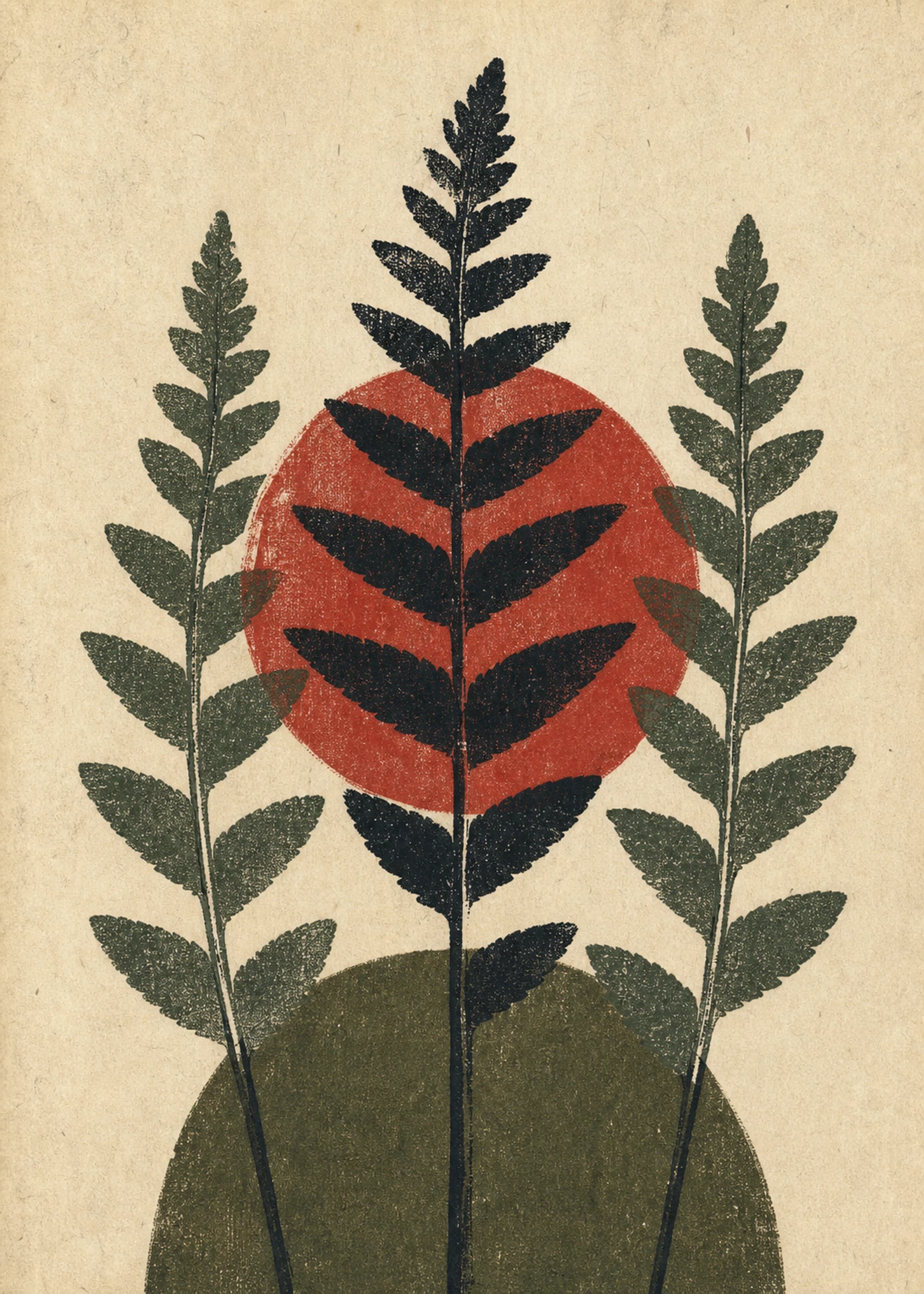
Relief printing starts with what remains
In an authentic relief print, the printable surface sits above the areas a maker removes. Ink is rolled across the raised surface; paper is pressed against it by hand or with a press. The carved recesses do not take ink, so they become the light or paper-colored parts of the image. The resulting impression reverses the design on the block.
That process makes subtraction visible. A printmaker cannot simply add a white stroke after inking a dark block: the light must be reserved by cutting it away. Strong relief compositions therefore often make positive and negative shape equally active. A white channel between leaves, a notch in a silhouette, or a narrow glint may be as intentional as the inked form around it.
Woodcut is the oldest major relief process. The maker carves a wood block, leaving the image standing in relief. Wood grain may register in the impression, but it does not have to; the species, cut of the block, tools, pressure, and inking all change the surface. A clean, precise woodcut can be just as authentic as one with visible grain.
Linocut and woodcut share a logic, not an identical surface
Linocut
The matrix is a sheet of linoleum. Its relatively even, soft surface supports sweeping cuts, broad flat shapes, and direct curves. Fine detail is possible, but lino does not impose wood grain on the mark.
Woodcut
The matrix is wood. Grain, density, and the direction of a cut can affect the mark. Some makers reveal those qualities; others carve and ink the block for a remarkably even result.
Linocut developed from woodcut by substituting linoleum for the wood block. Museums often describe its characteristic boldness, but that is a tendency rather than a rule. A maker can cut delicate lines in lino or build monumental fields in wood. Identify the relief logic first; treat the exact matrix as a separate question.
Six clues that an image speaks a relief-print language
- 1. Light appears carved from dark. White channels widen, taper, or stop like a tool has removed material. They feel structurally embedded rather than drawn on top.
- 2. Silhouettes carry the image. A leaf, face, building, or animal remains recognizable at a distance because broad shapes do more work than tiny tonal shifts.
- 3. Marks have a cutting direction. Repeated gouges may turn around a form, radiate from it, or build a current through the background.
- 4. Edges vary without dissolving. A boundary can contain small bites, flats, and pressure changes while still reading as a decisive edge.
- 5. Color behaves like separate decisions. In multiblock or reduction printing, colors arrive from distinct passes. Their shapes may touch, overlap, or leave a deliberate paper gap.
- 6. The composition tolerates reversal. Because the block prints in reverse, asymmetrical subjects and lettering demand advance planning. Mirrored text is a mistake; reversed spatial rhythm is part of the medium.
Color relief prints are engineered layer by layer
A color relief print may use a separate block for each color. The paper has to return to a consistent position so the layers align. The maker can also allow slight offsets, visible paper seams, or overprinted colors to become part of the image. Registration is a compositional choice before it becomes an imperfection.
In a reduction print, one block can be carved and printed in stages. More of the surface is removed before each subsequent color. Because earlier states are physically cut away, the sequence cannot simply be restarted. That destructive logic encourages careful planning and makes each color depend on the layers beneath it.
When looking at contemporary imagery, ask whether the palette feels separable. Can you imagine a dark key shape, a plant-green layer, and a red interruption arriving in distinct passes? If so, the image may evoke color relief printing even when it was composed with contemporary tools.
PosterBloom records a visual technique, not a fabrication claim
Influence, stated precisely
A PosterBloom artwork tagged “linocut” or “woodcut” evokes visual qualities associated with those processes: carved negative space, relief-like silhouettes, directional cuts, ink density, or layered registration. The tag does not claim that the original image was hand-carved or block-printed. The physical product you receive is a giclée fine-art print.
This distinction protects useful art vocabulary from becoming false provenance. “Linocut-influenced” tells you how to look. “Linocut” as a production medium would tell you how a specific object was made. Those are different claims, and PosterBloom keeps them separate.
How to choose relief-influenced art for a room
For a visually busy room
Choose one dominant silhouette and two or three large color fields. Relief-like economy can calm open shelving, patterned textiles, and collections of small objects without feeling blank.
For a quiet or minimal room
Look for visible cut rhythms, grain-like density changes, or a multicolor registration event. These details reward close viewing and keep a reduced palette from feeling generic.
For botanical and organic spaces
Carved contours pair naturally with leaves, wood, linen, and clay because both the subject and the mark carry direction. Avoid matching every green; repeat one secondary accent and let the paper field create breathing room.
Frame choice can shift the emphasis. Black extends the darkest relief shapes and makes the image more graphic. Oak or another warm wood echoes the history of the block while softening high contrast. A generous mat preserves the role of negative space instead of crowding the carved-looking edge.
A final recognition test
Squint at the image until detail drops away. If the composition still holds through a few interlocking light and dark shapes, it has the structural strength relief printing often demands. Then move close: do the small cuts reinforce volume, direction, and rhythm, or are they only decorative distress?
The strongest relief-influenced image works at both distances. Its silhouette carries the wall; its edge decisions explain how to keep looking. Roughness alone is not the style. The real visual language is disciplined subtraction.
Keep exploring
Sources and further reading
Selected sources for further reading. Room and styling recommendations are PosterBloom's editorial guidance.