Art literacy guide
How color and composition change a room's mood
Use value, saturation, scale, density, rhythm, and negative space to predict how wall art may change a room—without relying on universal color-psychology claims.
PosterBloom guide · 11 min read · Updated Jul 14, 2026
The useful version
Do not assign one emotion to one color. Decide what the room needs perceptually—more energy or rest, density or openness, focus or diffusion—then evaluate value, saturation, contrast, scale, and composition together. Personal and cultural associations remain part of the result.
Mood is an interaction, not a color lookup table
Claims such as “blue is calming” or “yellow makes people happy” collapse too many variables. Which blue: pale gray-blue, electric cyan, deep indigo, or green-blue? How large is it? Is it surrounded by white, orange, black, or wood? Is the image spare and horizontal, or crowded with diagonals and sharp edges?
Museum teaching resources are more useful when they ask viewers to connect atmosphere and mood to observable choices. The National Gallery of Art, for example, examines how artists use color, light, and formal elements rather than presenting a universal emotion dictionary. MoMA's teaching materials on color and environment ask viewers to consider color alongside shape, composition, proportion, balance, and scale.
A room adds another system around the work: architecture, furnishings, activity, light, sound, and the viewer's memories. Art changes that field by redistributing attention. It can make a blank wall feel anchored, compress a busy area into one focal point, or add visual activity to an otherwise quiet space.
Replace emotion labels with perceptual directions
Before choosing a print, describe the shift you want without naming a feeling. “More open,” “more grounded,” or “one clear focal point” gives you visual criteria. “Make it peaceful” does not.
Open ↔ dense
Open fields and fewer elements can expand visual breathing room; layered marks and tight intervals add density.
Stable ↔ directional
Horizontal weight and repeated intervals can stabilize; diagonals, cropping, and unequal forces create movement.
Quiet ↔ insistent
Close values and muted color lower separation; high contrast or saturation makes elements demand attention.
Unified ↔ varied
A limited system produces continuity; changes in shape, edge, color, and rhythm create variety.
Neither end of an axis is inherently better. A reading corner may benefit from a dense work that rewards close looking. A kitchen can support quiet art if its materials and daily activity already provide variety. Start with the existing room, not the room category.
Six controls shape the total effect
1. Value
Light–dark structure determines what remains legible across the room. A broad dark field can anchor; a high-key field can enlarge the sense of light. Close values produce subtler transitions but may disappear in dim conditions.
2. Saturation
Intense color attracts attention, especially when it is scarce elsewhere. Muted color can let texture and edge lead. A small saturated accent may be more insistent than a large grayed field.
3. Contrast
Contrast can come from value, hue, saturation, temperature, edge, scale, or shape. Multiple high contrasts produce visual activity; one dominant contrast establishes hierarchy.
4. Scale
Size changes the viewer's bodily relationship to an image. A color field that reads as a small accent at 30 × 40 cm can become an environment at 70 × 100 cm. Scale also determines how much of the wall's palette the art controls.
5. Composition
Balance, rhythm, focal point, negative space, edge, and direction organize attention through time. A centered symmetrical work is not automatically stable, and an asymmetrical work is not automatically energetic; the distribution of visual weight decides.
6. Personal and cultural context
The National Museum of Asian Art notes that perceptions of color can be rooted in culture and tradition. Subject matter, symbols, domestic memories, and regional associations can outweigh a generalized color convention.
A PosterBloom example: Cobalt Horizon Marker is both expansive and alert
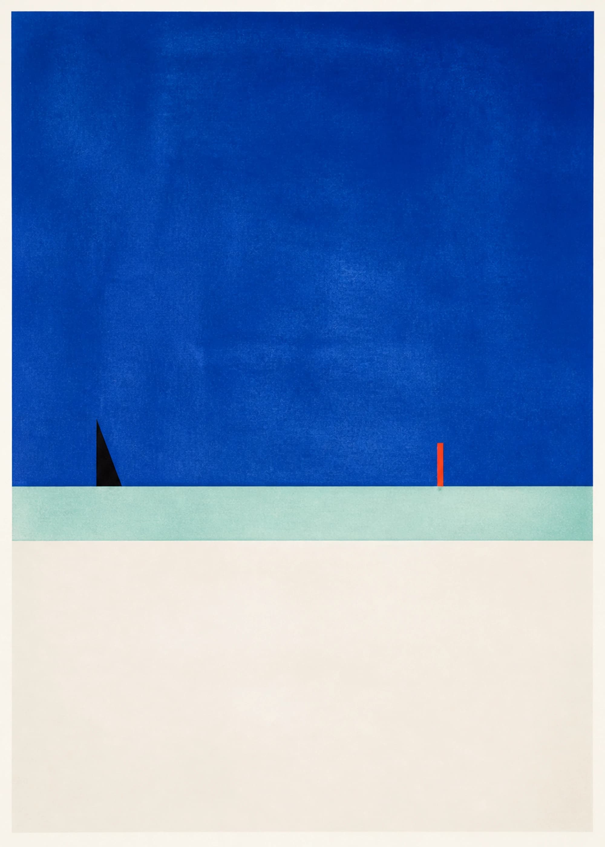
Cobalt Horizon Marker is dominated by a large cobalt field and a pale horizontal band above a broad near-white area. Those large, low-detail zones create openness and distance. Yet a black wedge and narrow red-orange marker interrupt the horizon, so the work is not passive.
We curated it for this guide because it resists a one-color mood claim. Calling it “calm because it is blue” misses the active scale jump, the high-saturation field, the sharp black point, and the orange accent. At larger print sizes, cobalt occupies more of the viewer's field while the small interruptions become landmarks. At smaller sizes, the whole work behaves more like a concise color signal.
Compare that structure with Electric Color Field, where several saturated hues and stronger internal changes increase visual activity. Then compare Quiet Load Bearing, whose mineral neutrals and weighty forms can ground a room without relying on a dark monochrome.
Composition can change what the same palette does
Imagine cobalt, cream, and orange in three arrangements. A low cobalt horizon under open cream may suggest distance. A centered cobalt circle surrounded by cream creates a focal object. Repeated cobalt and orange fragments across the surface create rhythm and distributed attention. The palette is unchanged; the room-distance behavior is not.
Horizontal structures often align with furniture and architecture, while strong verticals can counter long sofas or low cabinets. Diagonals lead the eye and can activate a static corner. Dense all-over pattern can make a sparse room feel inhabited, but may compete with shelving, books, textiles, or a view already rich in detail.
Use the composition and mark-making guide to trace focal point, rhythm, negative space, and edge before you assign an emotional label.
Match attention level to the room's real use
This is not a rule that bedrooms require low contrast or offices require energy. A person may want vivid art beside the bed and a sparse composition at work. The useful variable is the attention you want the wall to request during the activity that happens there.
Run a two-distance, two-light test
- View the artwork as a thumbnail. Name what survives: silhouette, field, dark anchor, horizon, repeated rhythm, or accent.
- Inspect the full image. Notice the detail, texture, edge, and smaller color relationships that close viewing adds.
- Place it into a daytime room photo. Check whether the wall gains the open/dense, stable/directional, quiet/insistent, or unified/varied shift you wanted.
- Repeat with evening lamps. Watch for lost dark detail, changed temperature, or an accent that becomes too dominant.
- Ask for your own association. After the formal reading, name what the subject and colors mean to you. Keep that answer even when it contradicts a generic mood label.
Choose a durable relationship, not a promised emotion
Art cannot guarantee that everyone entering a room will feel the same thing. It can reliably change emphasis, visual density, contrast, scale, rhythm, and the distribution of color. Those are observable decisions; mood emerges from them in context.
The durable choice is a work whose formal behavior supports the room and whose associations remain meaningful to you. If the palette relationship is still unclear, use the repeat, bridge, or interrupt workflow before deciding how strongly the artwork should lead.
Keep exploring
Sources and further reading
Selected sources for further reading. Room and styling recommendations are PosterBloom's editorial guidance.