Curated edit
Modernist Home Office Wall Art
Eight Modernist prints, chosen with the home office in mind. Expect work with a consistent hand—pieces that share a vocabulary instead of fighting for attention. Above a desk, one considered piece gives your eyes somewhere calm to land between screens. If two catch your eye, they were chosen to hang together through a shared color discipline. Everything prints to order using giclée fine-art printing on 200 gsm enhanced matte art paper with water-based pigment archival inks, with optional solid satin-laminated wood in natural oak-effect laminate or black satin laminate, with Perspex glazing and no mat or mount in the active configuration.
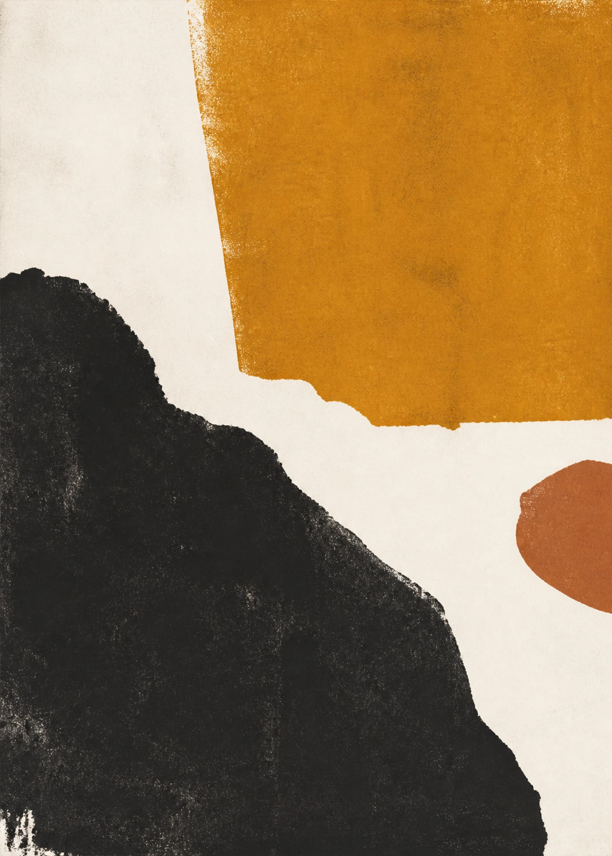
Ochre Stone
Black Mass / Warm Field
- charcoal
- ochre
- bone
From $42

Shared Circuit — Color Study
Soft Systems
- dark umber
- parchment
- vivid apricot
From $42
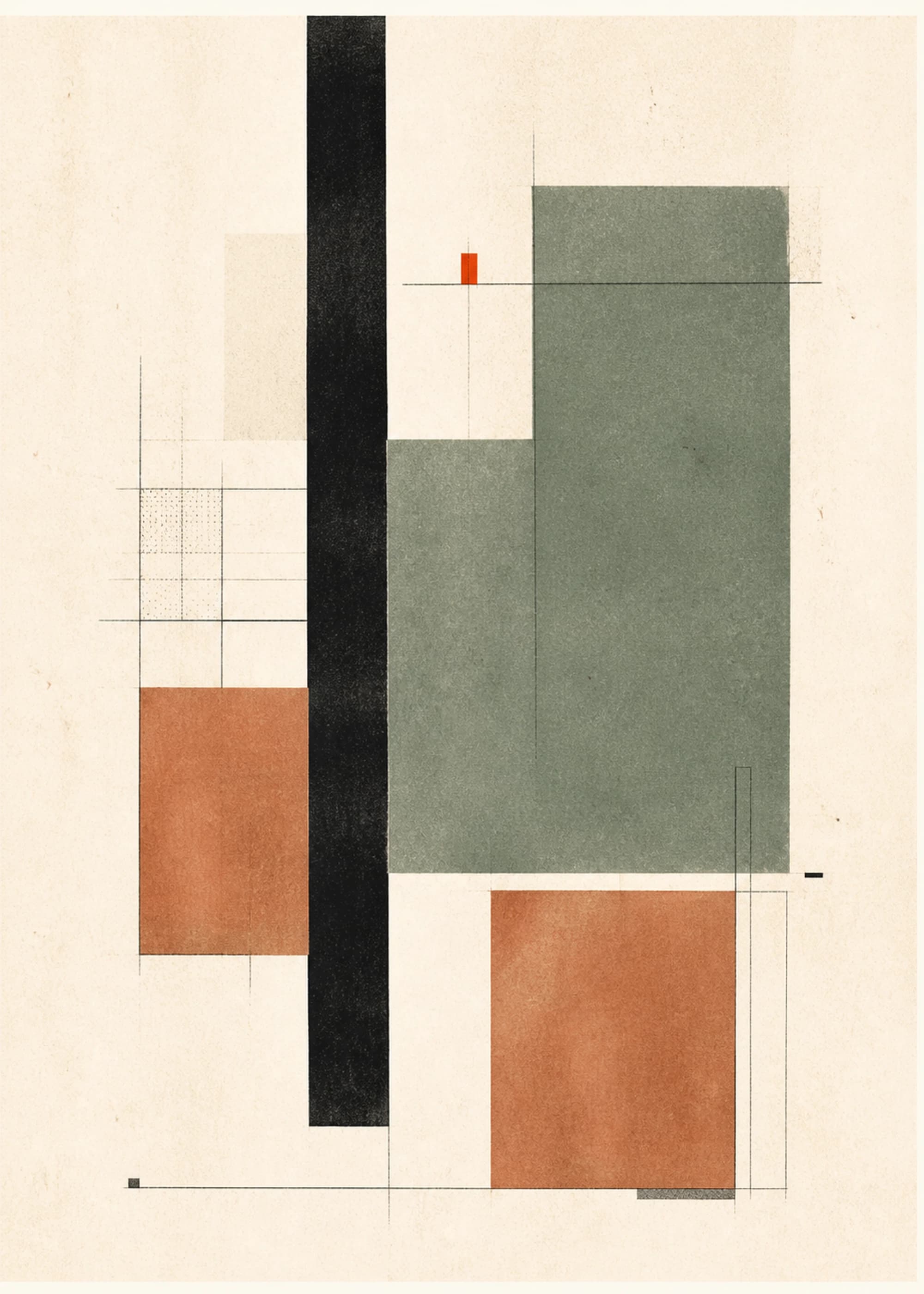
HomePort
Constructed Studies
- off white
- charcoal
- clay
From $42
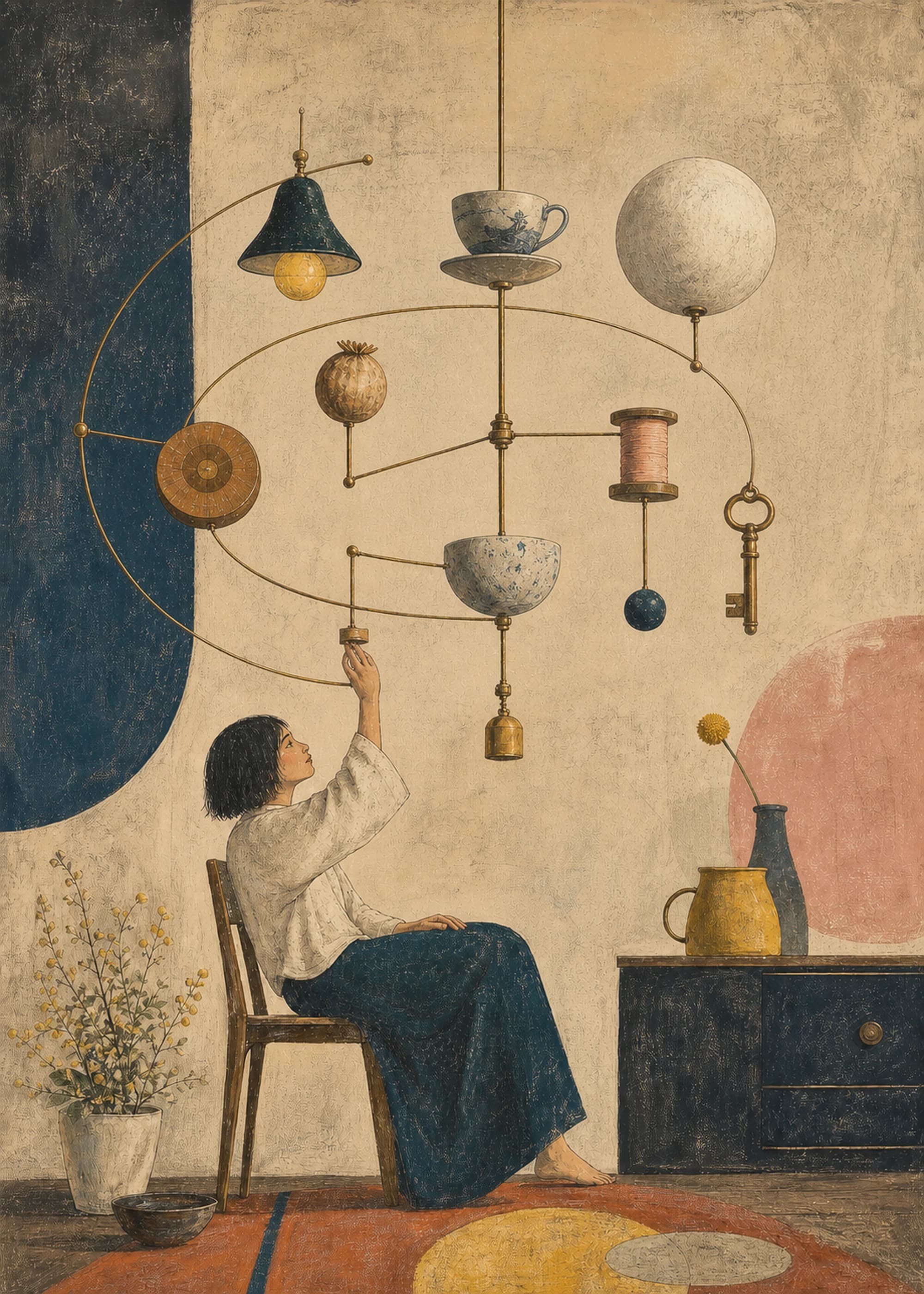
Domestic Orrery — Open Orbit
Soft Systems
- burnt sienna
- paper cream
- petrol blue
From $42
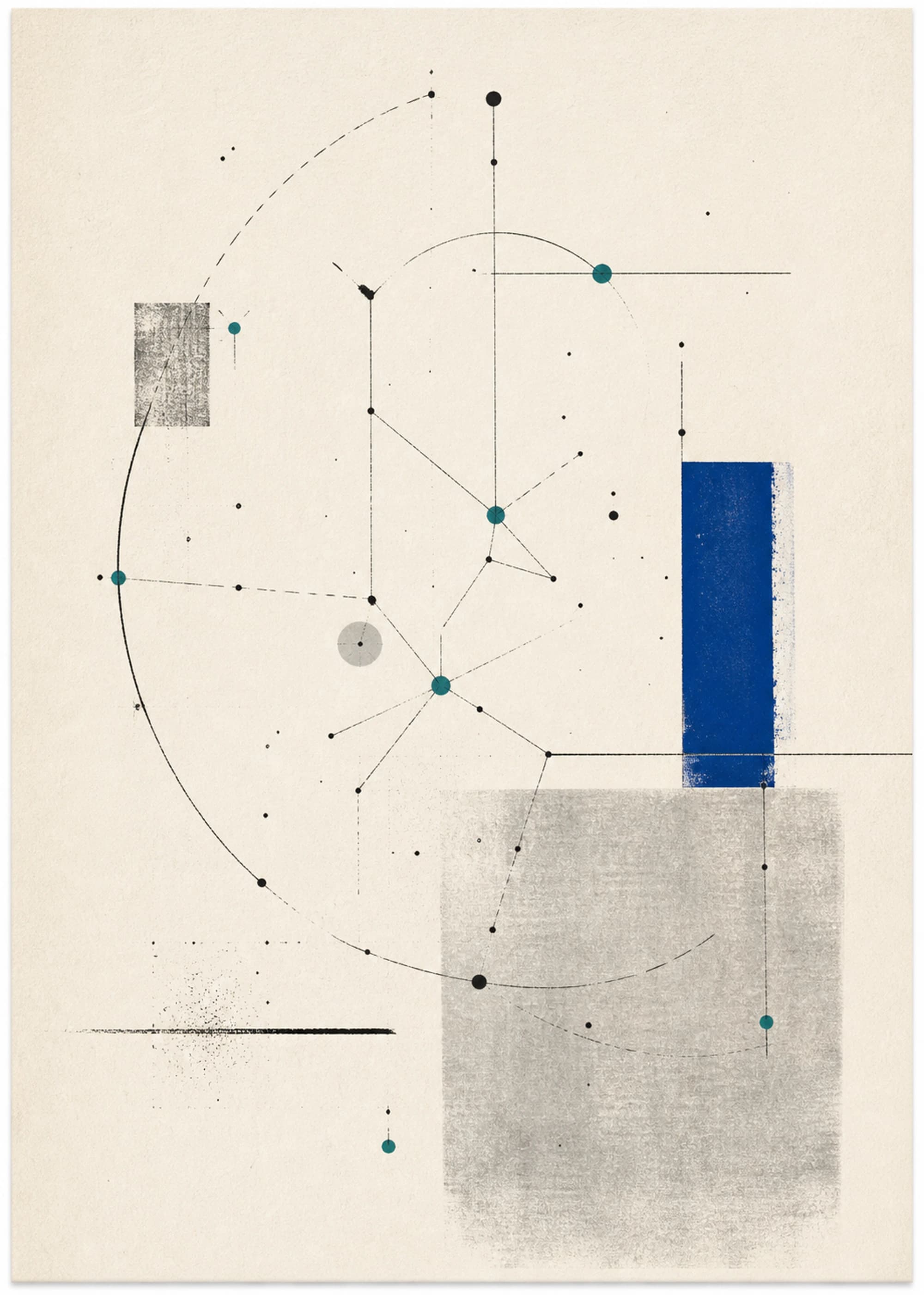
Celestial Orbit
Technical Humanism
- warm off white
- charcoal
- teal
From $42
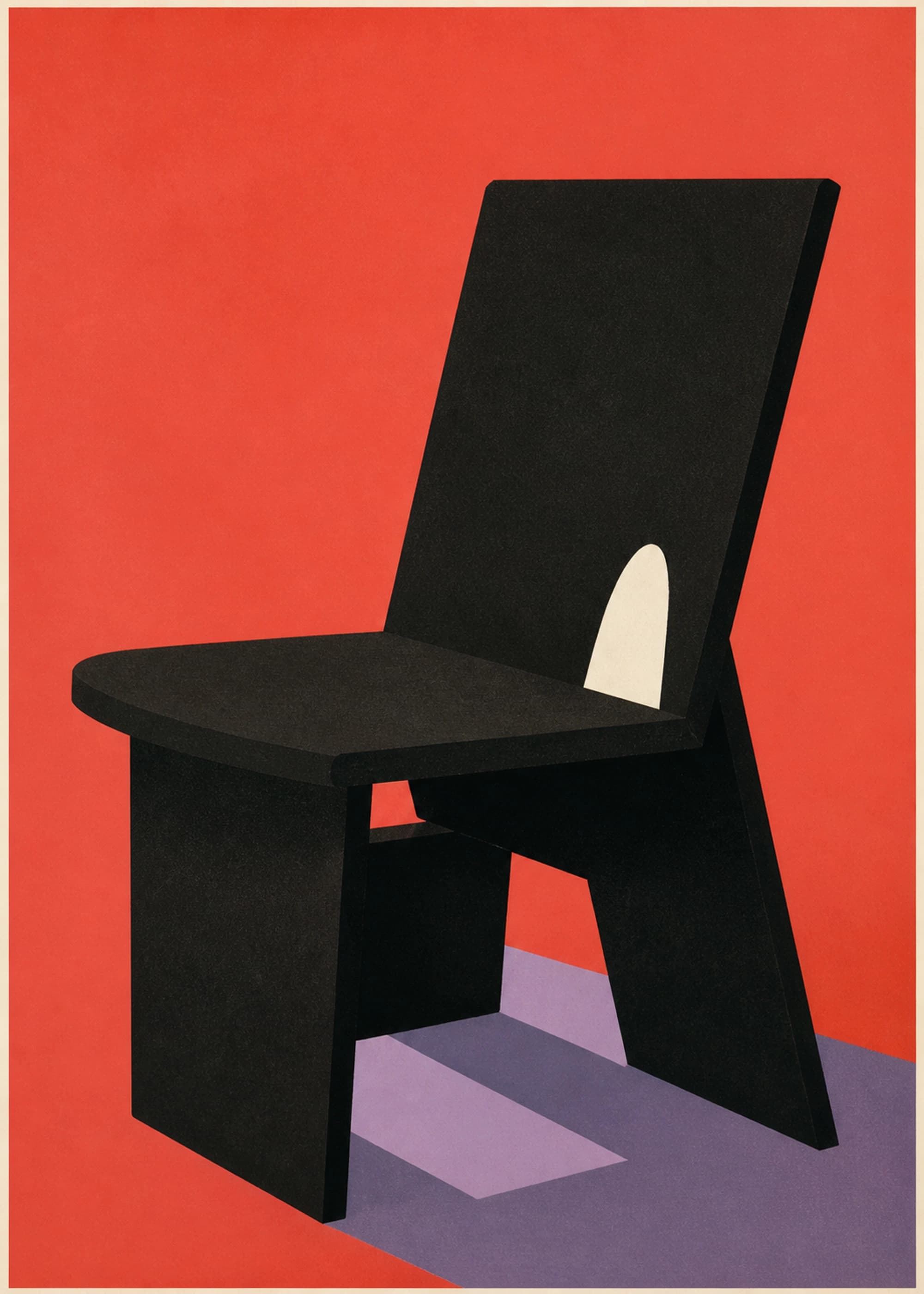
Coral Chair Study
Object Study
- coral red
- matte black
- lavender
From $42
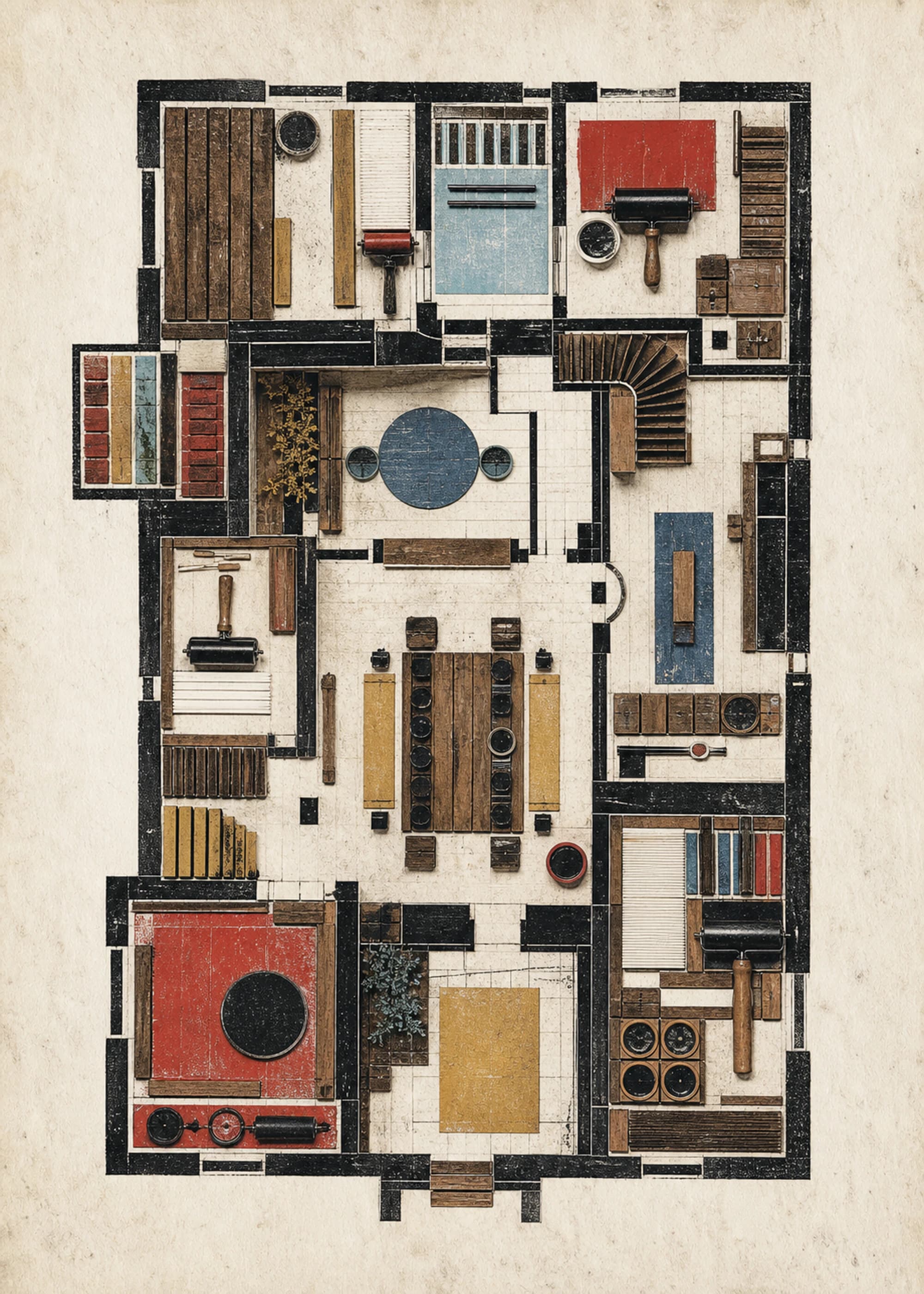
Typesetter's House
Soft Systems
- tobacco
- paper white
- cherry red
From $42
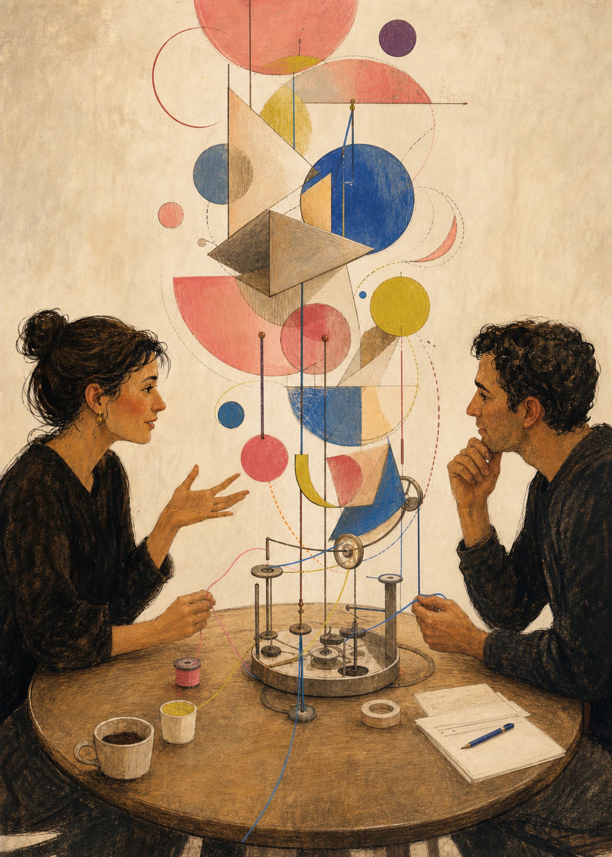
Conversation Engine — Hero Study
Soft Systems
- espresso
- parchment
- coral pink
From $42
How to choose from this edit
Measure the desk or usable wall rather than the full room. One portrait print suits a narrow return wall or the space beside shelving; a pair covers more of a wide desk while keeping the composition calmer than a scattered gallery wall. Check the main seated sight line and the video-call background separately: a strong grid or silhouette can hold at distance, while dense marks are better where you can approach them. Use black framing to continue dark typographic or architectural structure, or the natural oak-effect finish to reduce contrast near pale desks and timber shelving. When pairing works, repeat either a frame, a ground color, or a geometric rhythm and let one print stay visually quieter. Confirm the finished frame dimensions, leave clearance for monitor height and task lighting, and template the wall before placing hardware. Modernist describes the shared visual logic here; the individual product pages provide the exact size, frame, paper, and production choices.
From the knowledge library
Understand why these works fit together
Read the shared style, technique, and color ideas behind this edit, then return with a clearer basis for choosing between the prints.
- Modernism in Wall Art: A Practical Visual GuideLearn how modernist wall art uses geometry, abstraction, material, and negative space—and how to choose it without reducing a century of ideas to a decor label.
- How to Choose Art for Your Room PaletteChoose wall art by reading undertone, value, saturation, proportion, and room light—then decide whether the work should repeat, bridge, or deliberately challenge the palette.
- How Color and Composition Change a Room’s MoodUse value, saturation, scale, density, rhythm, and negative space to predict how wall art may change a room—without relying on universal color-psychology claims.