Art literacy guide
Gouache, watercolor, and ink
Compare opaque gouache, transparent watercolor, and fluid or drawn ink through edge, wash, bloom, drybrush, line, and paper—and read those visual influences honestly in contemporary wall art.
PosterBloom guide · 11 min read · Updated Jul 14, 2026
The useful version
Read the surface before naming the medium. Opaque blocks suggest gouache; luminous washes and reserved paper suggest watercolor; decisive line, pooled darks, and tonal wash suggest ink. These clues can overlap. On PosterBloom, the labels describe visual influence, while the physical object is a giclée art print.
Three families of marks, not three rigid looks
Gouache, watercolor, and ink can all be carried by water, used on paper, and moved with a brush. That shared setup does not make their visual behavior identical. The useful distinctions are opacity, edge, flow, and the role left to the paper beneath the mark.
The Victoria and Albert Museum describes watercolor broadly as dry pigment combined with a binder—usually gum arabic—and water. It also shows why “watercolor” cannot mean only pale transparent washes: artists can change the pigment, binder, and water balance to create thin transparency or thick, softly opaque bodycolour. Gouache became a common term for that more opaque family, often made by adding white.
Ink is broader still. It can make a calibrated pen line, a dry brush drag, a flooded wash, or a dense shape. MoMA's ink collection includes automatic drawing, architectural studies, data drawing, and expressive work. The medium name alone does not tell you whether the result will feel spare, gestural, precise, or atmospheric.
How to recognize each visual language
Gouache
Look for matte, opaque-looking color that can cover the paper and support crisp shape. Brush drag or slight value variation may remain inside an otherwise solid field.
Watercolor
Look for light passing through thin color, paper reserved as white, soft wet edges, blooms, granulation, and transparent layers that deepen where they overlap.
Ink
Look for line pressure, pooling, feathering, drybrush, concentrated darks, and decisive transitions between mark and open paper. Ink can also be diluted into atmospheric wash.
None of these clues proves the original process by itself. A digital image can simulate a wash; opaque watercolor and gouache overlap; ink can sit under, over, or beside another medium. Use several clues together, then choose language such as “gouache-influenced” when the actual production process is different or unknown.
Six surface clues worth naming
- 1. Opacity. Can you see paper or earlier color through the mark, or does the new layer cover what sits below it?
- 2. Edge. A wet edge diffuses; a dry or masked edge stays sharp. One picture can use both to separate atmosphere from structure.
- 3. Pool and bloom. Water can carry pigment toward an edge or push it outward as one wet area meets another. Those variations make flow visible.
- 4. Brush drag. A brush running out of liquid skips across the surface, exposing paper or a lower layer between bristle marks.
- 5. Line pressure. Width, darkness, and speed can change through one ink stroke. The line records direction rather than merely enclosing a shape.
- 6. Reserved paper. Unpainted space can provide the brightest light. It is an active shape, not an unfinished background.
Read a PosterBloom work: Electric Color Field
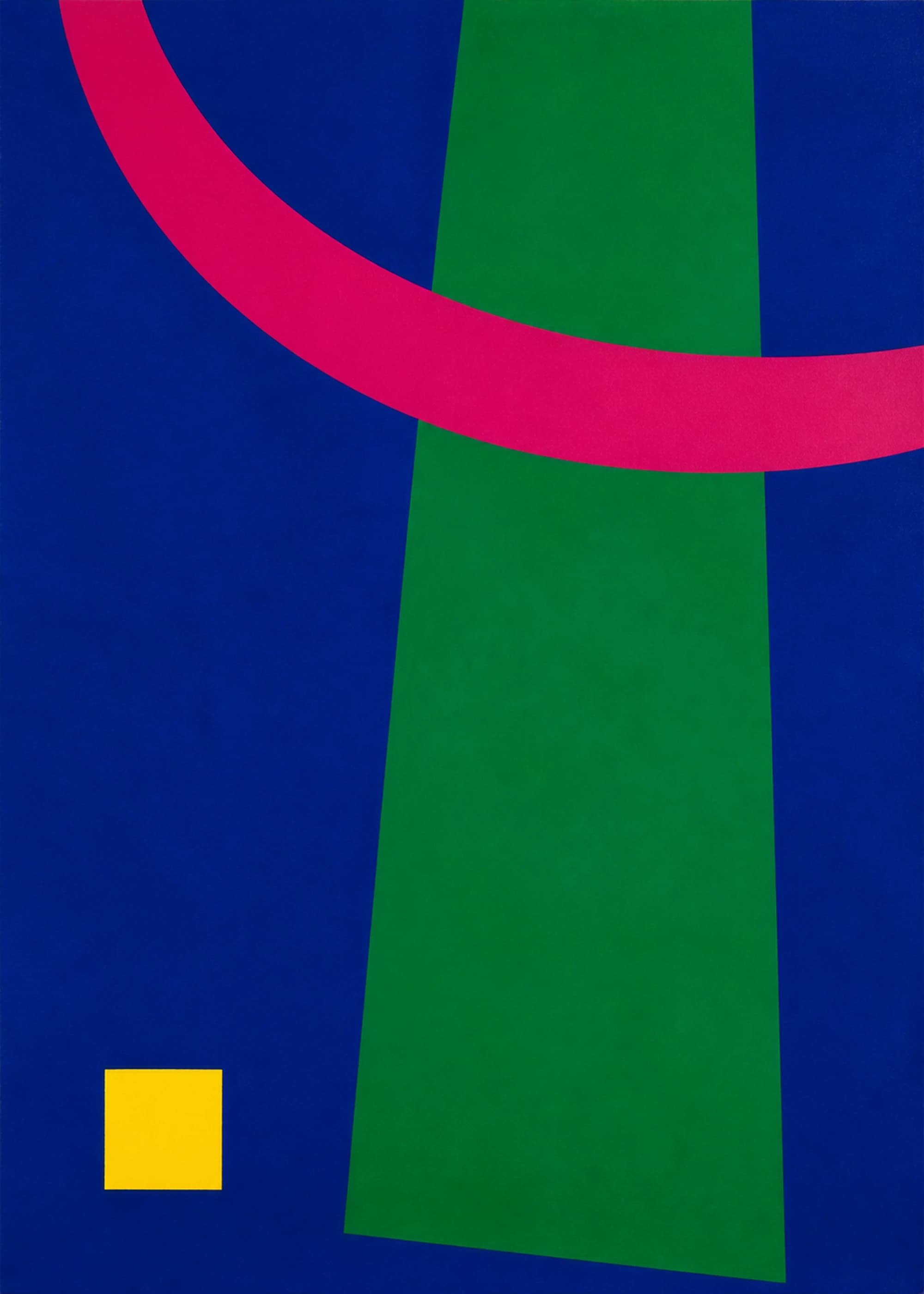
Electric Color Field uses broad cobalt and green planes, a hot pink arc, and one small yellow block. The fields read as opaque because each color maintains its own weight instead of behaving like a transparent veil. Soft surface variation keeps the large shapes from feeling like flat UI components.
The composition is useful because material language and color logic reinforce each other. The broad fields need gouache-like coverage to hold their saturation, while the small yellow block acts as a sharp value and scale interruption. The pink arc crosses the vertical structure like a brush-led movement rather than a neutral divider.
Physical-medium disclosure
“Gouache-influenced” describes the image's opacity, edge, and surface vocabulary. Electric Color Field is not sold as an original gouache painting. The physical product is a giclée art giclée fine-art print.
Choose the surface language for the room
For a visually busy room, opaque fields and a clear silhouette can create a stable anchor. The picture can carry strong color without adding many small details.
For a sparse or hard-edged room, watercolor-like blooms, ink drag, or visible paper can add motion and material variation. Choose enough value contrast that the work still reads from across the room.
For a low-light wall, avoid relying only on delicate pale washes. A stronger dark, a reserved light area, or one opaque shape helps the hierarchy survive when ambient light falls.
For a gallery wall, repeat one surface behavior rather than matching every color. A shared dry edge, open paper field, or matte block can connect otherwise different works.
What the technique label should—and should not—promise
A visual-technique label should help a shopper predict what the image looks like: opaque or transparent, controlled or fluid, sharply edged or diffuse. It should not imply that a giclée print was pulled from a painted sheet, that brush texture is physically raised, or that every simulated irregularity came from a historic process.
PosterBloom keeps image provenance and product production separate. We use “influenced by,” “evokes,” or “gouache-like” for the visual vocabulary, then state the physical print method plainly. That distinction makes the taxonomy useful without turning an aesthetic resemblance into a false material claim.
Keep exploring
Sources and further reading
Selected sources for further reading. Room and styling recommendations are PosterBloom's editorial guidance.