Art literacy guide
Screenprint, Risograph, and layered color
Recognize flat color fields, overprint, registration shifts, halftones, and limited palettes—and understand how PosterBloom uses these as visual-technique labels for giclée prints.
PosterBloom guide · 11 min read · Updated Jul 14, 2026
The useful version
Screenprint and Risograph are different processes, but both teach a powerful way to see color: as separate layers with their own shape, opacity, and order. Look for flat fields, purposeful overlap, visible paper, and a palette whose limits make the composition stronger.
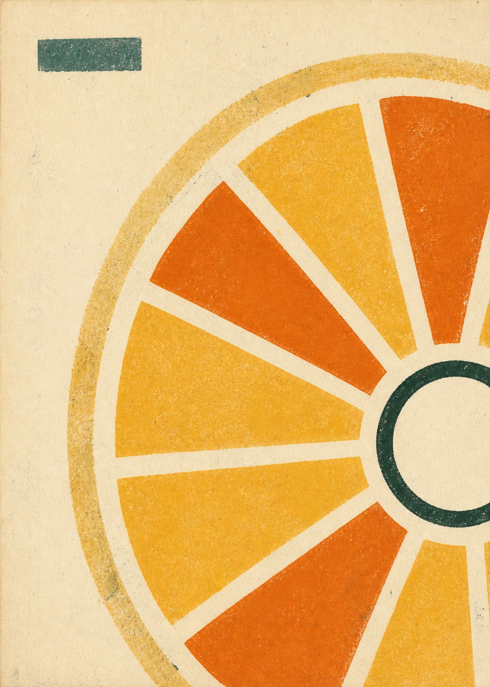
Screenprint pushes ink through a stencil
In an authentic screenprint, fabric mesh is stretched over a frame. A stencil blocks the parts of the screen that should not print, and a squeegee forces ink through the open mesh onto paper. A separate screen or printing pass is normally used for each color.
The process is capable of precise detail, gradients, and photographic halftones, but its most recognizable language is flat, decisive color. The stencil gives shapes a clear boundary; the ink can sit with a direct material presence. Where two translucent layers overlap, they can produce a third color without adding a third ink.
“Silkscreen,” “serigraph,” and “screenprint” describe the same broad stencil process. Silk was historically used for the mesh, while modern screens commonly use synthetic fabric. The terms do not designate a single art movement or visual style.
Risograph is a digital duplicator with a stencil-printing core
RISOGRAPH is RISO's digital duplicator system. The machine scans or receives an original, creates a perforated master, wraps that master around a printing drum, and presses ink through its openings as paper moves through. It was designed for fast, economical runs of repeated documents rather than as a fine-art process.
Designers and artists adopted the machine because its constraints are generative. Each ink drum carries one color. Additional colors can require separate layers or another pass, while two-drum models can print two colors together. Halftone screens translate continuous tones into dots, and the color of the paper remains an active part of the palette.
A Risograph print is not a screenprint made faster. One uses a digital duplicator and an automatically made master; the other uses a framed mesh screen and squeegee. Their images can rhyme because both reward separated color, stencil logic, and economical form.
Compare the two processes without flattening them
Screenprint tends toward
- Crisp stencil boundaries
- Broad, opaque ink fields
- Controlled registration
- Fine halftones when the screen permits
Risograph tends toward
- Visible halftone structures
- Ink that lets paper and lower layers participate
- Small registration shifts across colors
- A limited, machine-specific ink vocabulary
These are tendencies, not authentication tests. Screenprint can be soft and painterly. Risograph can be tightly registered. A digital image can imitate either surface. Process labels should be based on fabrication evidence; visual-language labels can describe what an image asks the eye to notice.
Read layered color as a small system
- 1. Separate the base colors. Ignore the apparent full palette and identify the likely ink layers. A warm red and cool blue can create a dark violet overlap; paper may supply the lightest value.
- 2. Find the overprint. Look for an area where one translucent shape crosses another and creates a visible third relationship. That intersection often carries more energy than either layer alone.
- 3. Inspect the registration. A hairline paper gap or colored halo can reveal how layers meet. The shift should clarify motion, depth, or rhythm—not simulate “handmade” character without purpose.
- 4. Read the dots. Halftones turn density into pattern. Larger or more open dots feel active and graphic; finer screens can appear tonal from a normal viewing distance.
- 5. Notice what remains unprinted. Paper is not an empty default. It can separate saturated fields, form highlights, and prevent two-color work from becoming heavy.
Limited color is a compositional advantage
A small palette forces every color to take a job. One layer can establish the subject, another can interrupt it, and the overlap can create depth. Because the colors recur, the eye quickly learns the system and notices when the artist breaks it.
This is why two- and three-color imagery can feel more vivid than a picture containing every hue. Saturation is concentrated. A citrus yellow, leaf green, and warm red can establish subject, shadow, and focal accent without modeling every natural color. Constraint creates hierarchy.
Do not confuse color limitation with simplicity. A dense halftone, an overprinted shadow, a knocked-out paper line, and a registration shift can all coexist inside two inks. The sophistication lies in how layers interact, not in the number printed on a palette card.
PosterBloom uses these terms as visual-taxonomy signals
What “screenprint” or “risograph” means here
The taxonomy describes a visual technique the artwork evokes: stencil-built shapes, separated inks, overprint color, halftone texture, or registration rhythm. It does not claim that the original artwork was pulled through a screen or printed on a RISO machine. PosterBloom's physical products are giclée fine-art giclée fine-art prints.
“Influenced by” is the honest bridge. Contemporary work can study the color economy and public-communication force of screenprinting, or the layered constraints associated with Risograph publishing, without pretending to be an analog edition from either process.
Choosing layered-color art for a room
Let the dominant ink set the room's temperature
A yellow- or red-led print can warm white walls and pale wood. A blue- or green-led image can steady a bright kitchen or office. Treat the smallest contrasting layer as an accent, not a command to match every object.
Match visual density to viewing distance
Large flat shapes hold up across a living room or dining area. Fine halftones and close registration reward a hallway, desk, or breakfast nook where the viewer can approach the surface.
Build a gallery wall by ink logic
Pair works that share one anchor color but use it at different proportions. A mostly yellow print can sit beside a mostly green one if the same red appears as a small index in both.
White and natural-wood frames preserve the feeling of paper and let layered color lead. Black frames add another hard boundary and work well when the image already has a dark key layer. Give highly saturated art enough surrounding wall that its color can expand without fighting nearby objects.
What not to use as proof of process
Misregistration is not exclusive to Risograph, and perfect registration does not exclude it. Flat color is not automatically screenprint. A halftone filter can be made digitally in seconds. None of these surface cues can authenticate an object on its own.
Use the cues to read composition: how colors were conceptually separated, where they overlap, and why the paper remains visible. Use provenance, edition information, and fabrication records to identify a physical printmaking process. Visual literacy becomes more useful when it knows the limit of what an image can prove.
Keep exploring
Sources and further reading
Selected sources for further reading. Room and styling recommendations are PosterBloom's editorial guidance.