Art literacy guide
Brutalism in art and interiors
Understand Brutalism’s postwar architectural context, its visual language of mass and material, and how brutalist-influenced wall art can work in a livable interior.
PosterBloom guide · 9 min read · Updated Jul 14, 2026
The useful version
Brutalism is not “anything gray and severe.” Read it through exposed material, structural clarity, repeated modules, monumental mass, and the social ambitions of postwar building. At home, keep the force but add light, tactile contrast, and human scale.
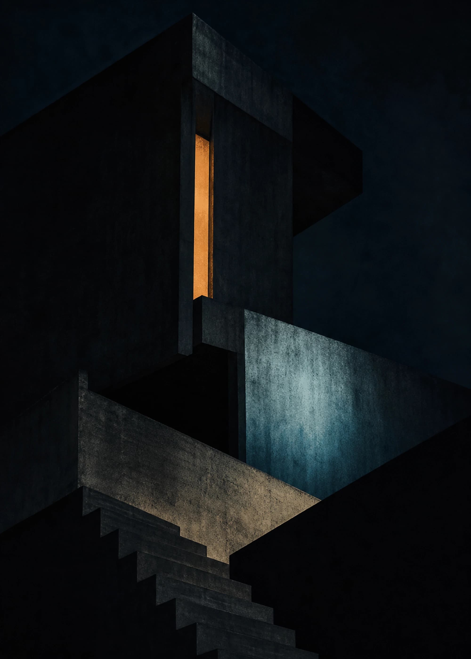
Brutalism began as architecture, not an internet mood board
Brutalism emerged in the middle of the twentieth century as Europe rebuilt after World War II. MoMA describes a context of large reconstruction programs, material shortages, and pressure for economical building. Architects often exposed structure and materials instead of hiding them behind decorative cladding. Concrete was common, but the deeper idea was directness: make construction, circulation, and material presence legible.
The name is connected to the French béton brut, or raw concrete, and to debates around the New Brutalism in Britain. Architectural historian Reyner Banham framed it as an ethic as well as an appearance—one concerned with formal clarity, structural presentation, and raw materials. That distinction explains why a concrete-look lamp or a distressed gray poster may feel “brutalist” without carrying much of Brutalism’s architectural logic.
Brutalist buildings were often civic: housing, universities, arts centers, offices, and public infrastructure. Their scale and institutional associations attracted both admiration and criticism. Reading them responsibly means holding the aspiration and the lived result together, not treating the movement as either heroic utopia or ugly failure by default.
The visual language: mass, module, material, and movement
Mass
Large, weighty forms project permanence. Deep recesses and overhangs make the building—or image—feel carved rather than decorated.
Module
Repeated windows, bays, panels, and circulation units turn structure into rhythm. Repetition may be strict, stepped, or deliberately interrupted.
Material
Concrete texture, board marks, aggregate, steel, brick, and glass remain visible. Light reveals their grain instead of disguising it.
Movement
Ramps, bridges, stairs, terraces, and stacked levels make circulation part of the composition. Brutalism can be spatially complex even when its palette is restrained.
The Barbican makes this combination concrete. Chamberlin, Powell and Bon planned a “city within a city” with homes, schools, a church, library, lake, conservatory, and arts center. Its public interiors contrast hand-hammered reinforced concrete with brass rails, wood-block floors, terrazzo, water, and planting. Brutalism’s most memorable spaces are rarely one-note; hard material gains force through contrast.
How Brutalism moves from buildings into images
Wall art cannot reproduce an architectural experience, but it can translate its visual operations. A photograph can compress monumental volume into planes of light and shadow. A drawing can isolate circulation or structural rhythm. An abstract work can borrow the weight of a cantilever, the repetition of a facade, or the roughness of shuttered concrete without depicting a building at all.
Look for deep value contrast, cropped mass, repeated units, compressed perspective, blunt typography, exposed texture, and a sense that forms bear weight. The strongest brutalist-influenced art usually contains a counterforce: a narrow light, a soft edge, a plant-like curve, a human-scale detail, or a warm note against mineral neutrals.
Influence, stated honestly
PosterBloom calls contemporary work “brutalist-influenced” when it borrows formal qualities such as mass, repetition, exposed texture, or architectural contrast. That describes a visual relationship. It does not claim that a print is a historical Brutalist work, a reproduction of a named building, or affiliated with its architect.
A five-part test for brutalist-influenced wall art
- 1. Does it feel constructed? Forms should interlock, stack, span, or bear visual weight. Random rectangles are not automatically architectural.
- 2. Is the texture specific? Grain, pitting, seams, ink drag, or rough edge should reveal a process. A generic grunge overlay is surface styling, not material thinking.
- 3. Does repetition establish scale?A field of windows or modules can make one disruption feel enormous. Without a recurring measure, “monumental” often becomes merely large.
- 4. What does light do? In strong examples, light cuts, grazes, silhouettes, or reveals depth. Flat gray lacks the spatial drama associated with concrete architecture.
- 5. Is there a human counterpoint?Scale becomes meaningful against a doorway, handrail, tree, small accent, or implied body. Even pure abstraction benefits from one element that lets the eye measure the rest.
Making brutalist wall art livable
Use the art as the room's hard edge, then let other materials provide relief. Oak, walnut, wool, linen, leather, cork, and plants keep a concrete or charcoal vocabulary from feeling airless. This is historically more convincing than filling the room with imitation cement: important Brutalist interiors already used wood, metal, terrazzo, water, planting, and carefully controlled light.
Value matters more than the color name. A near-black print on a dim wall can disappear into one heavy block. Give dark work a pale wall, direct daylight, or a mat that creates a light boundary. In a bright room, a charcoal composition can act as an anchor; in a dark room, choose visible midtones and one luminous interval.
Frame finish changes the reading. Black extends the graphic structure and feels more severe. Oak introduces warmth and separates the work from literal architectural photography. For a pair or grid, consistent spacing reinforces the modular logic. For a single print, size up: monumental forms usually need enough wall area to retain their physical effect.
Three room strategies that avoid the theme-park effect
One monolith
Hang one large, high-contrast architectural work above a simple sofa or sideboard. Keep surrounding objects low and tactile. This lets the image carry the mass without turning every accessory into a concrete reference.
A structural grid
Use two or three matching frames with images that share horizon lines, facade rhythms, or tonal values. Align edges precisely and keep narrow, equal gaps. The hanging itself becomes architectural.
Hard form, living color
Pair a mineral or monochrome print with olive, rust, cobalt, or deep burgundy in one textile. A controlled color note can reveal concrete's warmth and prevent the room from reading as a grayscale filter.
Keep exploring
Sources and further reading
Selected sources for further reading. Room and styling recommendations are PosterBloom's editorial guidance.