Art literacy guide
Geometric art and visual order
Learn how geometric art uses grids, repetition, proportion, edges, and optical tension—and how to distinguish a visual language from a historical movement.
PosterBloom guide · 10 min read · Updated Jul 14, 2026
The useful version
Geometry is the vocabulary; visual order is what the artwork does with it. Look for relationships among proportion, interval, edge, repetition, color, and empty space. A work is not historically “geometric abstraction” simply because a retailer can describe it as geometric wall art.
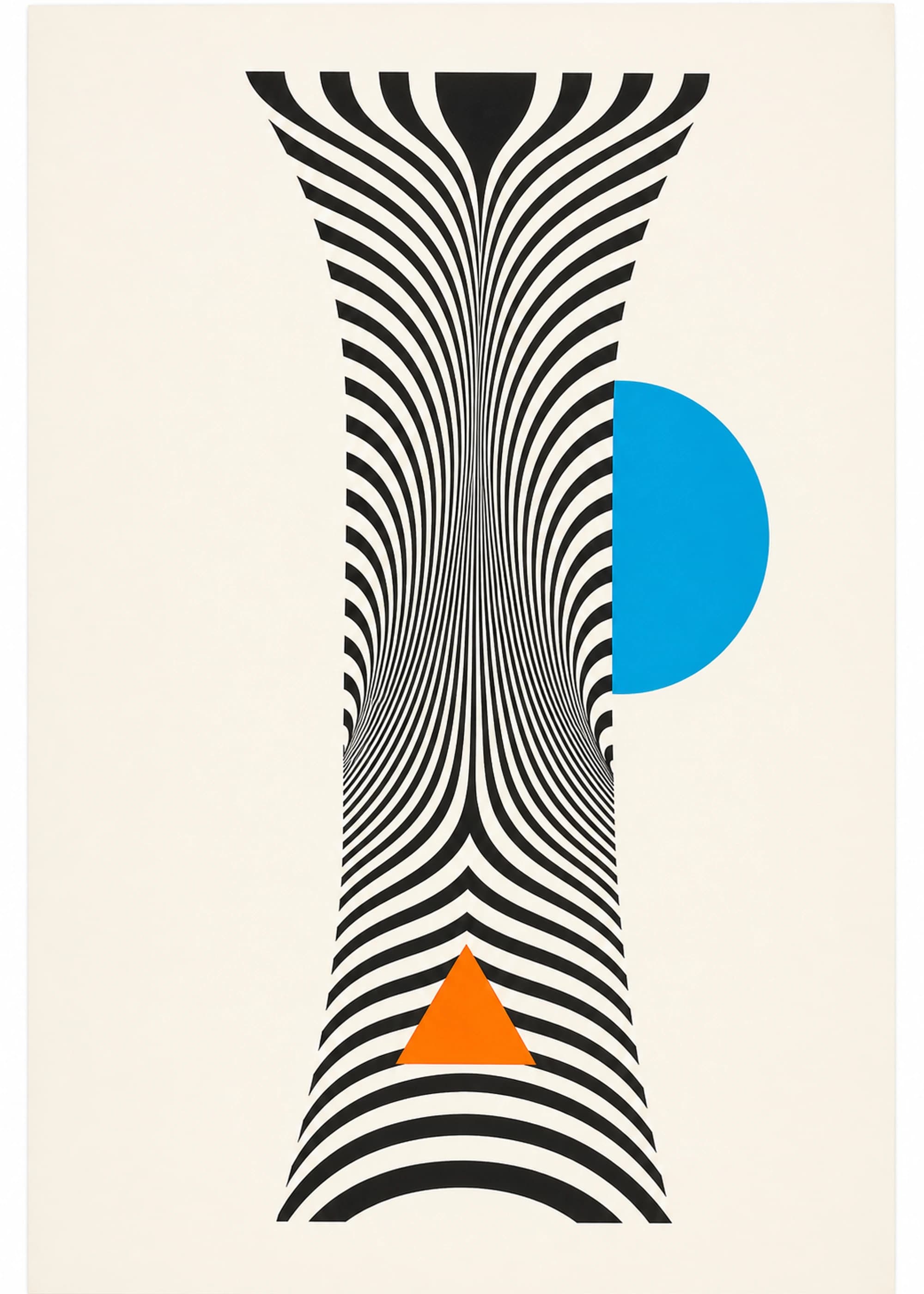
Geometric abstraction is more specific than geometric decor
In everyday shopping language, geometric art can mean almost any image built from circles, rectangles, grids, stripes, or polygons. It may be abstract, architectural, diagrammatic, representational, ornamental, or simply patterned. That broad label is useful for browsing, but it is not an art-historical classification by itself.
Museums use geometric abstraction more precisely for abstract work organized through geometric, hard-edged, or linear forms. In its nonobjective forms, shapes occupy the flat pictorial field as relationships in their own right rather than describing a recognizable subject. A floor-plan drawing, a textile pattern, and a nonobjective painting may all be geometric; only the last is necessarily geometric abstraction.
This distinction keeps a visual filter honest. PosterBloom uses “geometric” to describe what a contemporary print asks you to notice—measured forms, repeated intervals, hard or controlled edges—not to claim that it belongs to a named historical movement.
A field with many histories, not one universal style
The history of geometric abstraction is plural. The Metropolitan Museum of Art traces different developments through Cubism, Mondrian and De Stijl, Malevich's Suprematism, Russian Constructivism, Bauhaus teaching, French groups such as Cercle et Carré, American abstract artists, and later Minimalism. These artists and groups did not share one program. Some pursued spiritual or perceptual aims; some connected form to industrial material, design, or social transformation; some rejected illusion so that shape, color, and surface could become the subject.
The Met's history also shows how ideas moved among groups while their aims remained distinct. Treating the whole field as a single “Bauhaus look” erases differences in politics, material, and purpose. A useful contemporary guide should show the shared formal tools without pretending their histories are interchangeable.
Influence, stated precisely
PosterBloom may call an original contemporary print “geometric,” “modernist-influenced,” or “in conversation with Constructivist and design-school vocabularies” when its formal evidence supports that description. We do not call it a historical Constructivist, De Stijl, Bauhaus, or Suprematist work, and we do not imply authorship, reproduction, affiliation, or endorsement by a named artist, school, estate, or museum.
Six relationships that create visual order
Proportion
Compare area, width, and visual weight—not just shape names. A small dark square can counter a much larger pale field.
Interval
Repeated gaps establish rhythm. One compressed or widened interval becomes meaningful because a measure already exists.
Alignment
Edges and axes let the eye connect separated forms. An implied line can organize a work even when no line is drawn.
Hierarchy
Scale, value, saturation, and placement decide what arrives first. Order does not require every element to be equally quiet.
Edge
A form that touches or crosses the frame feels different from one floating inside it. Cropping can imply a system continuing beyond the paper.
Counterpoint
A curve among rectangles, one warm note in a cool field, or one broken module prevents order from becoming mechanical sameness.
Texture does not cancel geometry. Registration shifts, paper grain, ink drag, collage seams, and hand-cut edges can make a measured system feel made rather than generated. The useful question is whether those variations clarify the structure or merely decorate it.
Read a PosterBloom work: HomePort
In HomePort, a heavy black vertical divides the field without centering it. Clay rectangles and a muted green plane create unequal areas on either side, while thin construction lines extend across the larger masses. The small vermilion index is the most saturated note, so it becomes a focal event despite its size.
The composition is geometric, but its order is not a perfect grid. Elements align and then stop short; some forms overlap while others appear lightly registered into the paper. That tension between measurement and surface is more informative than saying the print “has rectangles.” It explains why the work reads as architectural and tactile at the same time.
HomePort is an original contemporary PosterBloom design. Its grid, hard-edged planes, limited palette, and asymmetric balance can be discussed in relation to modernist and geometric-abstraction vocabularies. It is not a reconstruction of a historical artwork or an object made by a historical school.
How to choose geometric art for a real room
- 1. Diagnose the room's existing order. Window mullions, shelving, tile, paneling, and furniture already create axes. Echo one relationship rather than every line. A strict print can calm a visually busy room; an irregular system can animate a room that is already rigid.
- 2. Choose contrast before matching color. In a pale room, decide whether the artwork should anchor the wall with a dark mass or remain low-contrast. This affects presence more than matching a cushion to one small accent.
- 3. Let scale preserve the system. Fine grids and small intervals need enough print area to remain legible. Spare, broad forms usually need enough width to hold the wall rather than float like a sample card. Use the print size guide before choosing a frame.
- 4. Use framing as another edge decision. A black frame can extend a dark structural line. Natural wood can interrupt hard geometry with warmth. In a set, equal gaps and aligned edges become part of the artwork's visual order.
Four shortcuts that weaken the category
“It has circles, so it is Bauhaus”
The Bauhaus was a specific school with changing directors, workshops, disciplines, and political conditions. A circle and primary color are not proof of institutional lineage.
Symmetry as the only form of balance
Many strong geometric works use asymmetric equilibrium. Visual weight can be balanced across distance without mirrored shapes.
Geometry as emotionless
Tight spacing can feel compressed; a floating plane can feel unstable; repeated modules can feel meditative or insistent. Formal control still produces mood.
Pattern without hierarchy
Repetition can be intentional, but if every element has the same size, value, and spacing, the eye may have nowhere to enter. Look for variation that gives the system consequence.
Keep exploring
Sources and further reading
Selected sources for further reading. Room and styling recommendations are PosterBloom's editorial guidance.