Art literacy guide
Organic modern art and interiors
Understand organic modern as a contemporary interiors and merchandising category built from natural form, material warmth, restraint, and modernist structure—not a single historical movement.
PosterBloom guide · 10 min read · Updated Jul 14, 2026
The useful version
Organic modern is a current interiors and merchandising category, not one historic art movement. Use it as a practical description of rooms and artworks that balance modern structure with natural form, tactile material, irregular rhythm, and visual breathing room—not as a fictional period label.
Start with the boundary: this is not a historic movement
“Organic modern” does not name a single organized school of artists, a manifesto, or a movement with agreed dates and membership. In contemporary interiors and retail, it is a broad category used to group modern restraint with curved forms, natural references, tactile surfaces, and materials such as wood, stone, linen, clay, and wool.
That makes it useful for finding a room feeling, but weak as a claim about historical origin. A recent print may fit an organic-modern interior because its contours, rhythm, palette, or surface mediate between a rectilinear room and the irregularity of nature. It does not become part of a twentieth-century “Organic Modern movement” by doing so.
The honest way to add depth is to examine several relevant lineages—biomorphic abstraction, organic design, organic architecture, landscape-derived mark-making, and modern craft—while keeping their meanings distinct. They offer context, not one neat family tree leading to today's shopping term.
Three adjacent histories—and why they are not synonyms
Biomorphic form in art
Biomorphic forms are abstractions that evoke living forms such as plants, organisms, or parts of the body. Rounded, swelling, branching, cellular, or bone-like shapes can feel alive without illustrating a particular species. MoMA's biomorphic collection provides examples across artists and media; biomorphic describes visual resemblance, not a required neutral palette or interior style.
Organic design in furnishings
For MoMA's 1941 Organic Design in Home Furnishingsexhibition, curator Eliot Noyes described organic design through the coherent organization of a whole according to structure, material, and purpose. The exhibition and its manufacturing competition concerned furniture, lighting, and textiles—not an art movement defined by leaf shapes.
Organic architecture
Frank Lloyd Wright's philosophy treated building, furnishings, setting, time, place, and inhabitants as an integrated whole. That is a theory of architecture and life, not a synonym for beige decor. It helps explain why material and site relationships matter, but a curved print in a living room is not thereby an example of Wright's organic architecture.
The visual language: how natural order differs from decoration
Irregular contour
Edges swell, erode, branch, pool, or taper. Variation should feel structurally related, not like a random wobble added to a basic shape.
Growth rhythm
Natural systems repeat with change: leaf to leaf, ring to ring, bend to bend. Similarity plus variation creates a more living rhythm than a copied module.
Material evidence
Grain, fiber, brush drag, bleed, collage edge, and mineral-like layering let surface participate in the image rather than imitate a generic texture filter.
Structured asymmetry
Organic does not mean formless. Weight, direction, and negative space can remain carefully controlled even when the outlines are irregular.
Built–natural tension
A straight edge against a soft mass, or a measured frame around a wandering mark, makes each language more legible through contrast.
Atmospheric depth
Soft value transitions and overlapping fields can suggest air, distance, or growth without turning the work into a literal landscape.
Subject and form are separate decisions. A botanical illustration can be crisp and geometric; an entirely abstract ink wash can behave like weather, rock, or water. “Organic” is strongest when the label identifies how the composition grows and moves—not merely that a plant appears somewhere in the image.
Read a PosterBloom work: Quiet Load Bearing
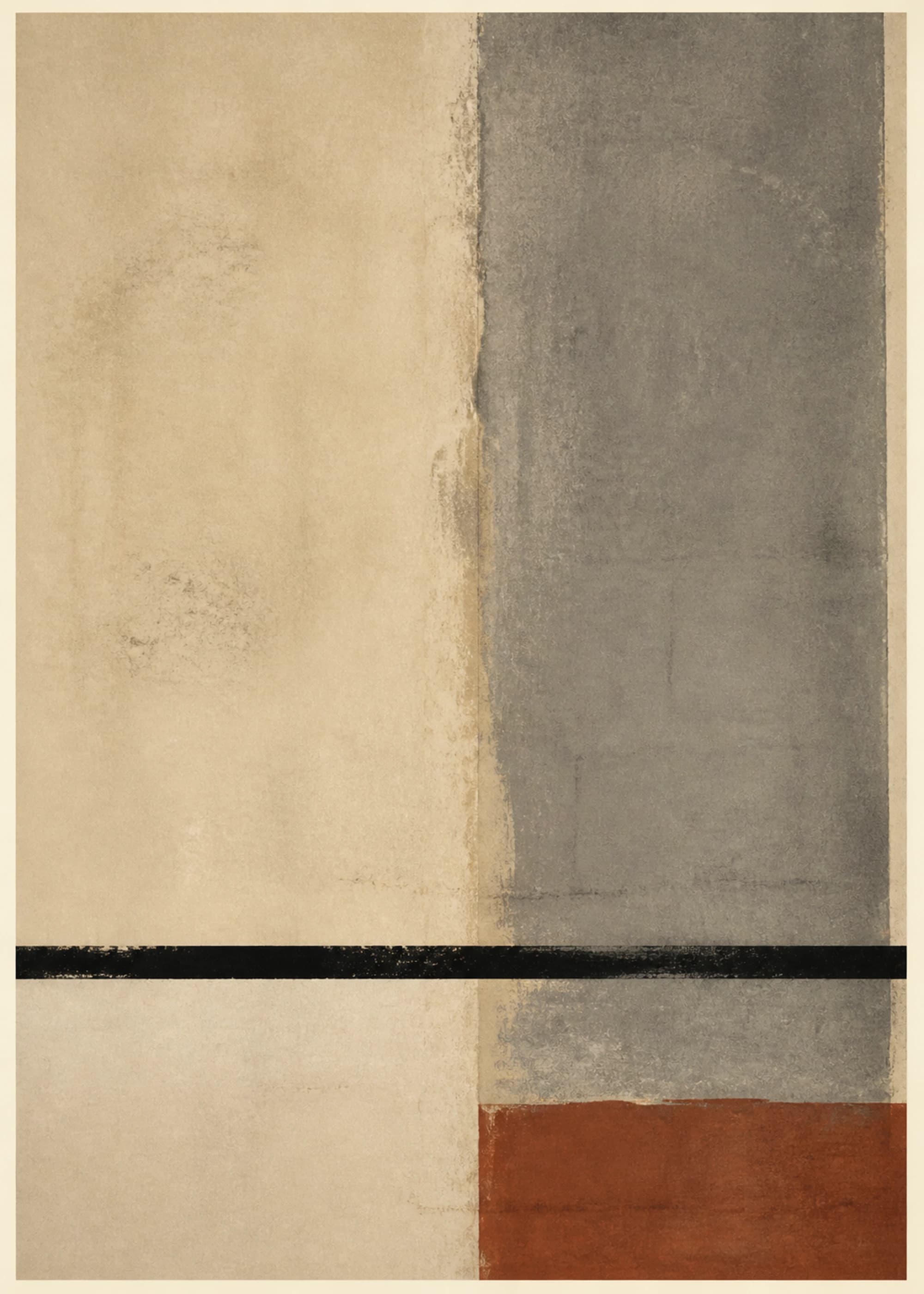
Quiet Load Bearing divides a warm cream field from a broad mineral-gray plane, then holds both with a hand-marked black rule and one low rust block. The geometry is strict, but the dragged edges and uneven pigment keep the surfaces from reading as digitally perfect panels.
This is useful evidence that organic modern does not require a leaf or curve. The organic reading can come from material cues: mineral color, paper warmth, softened boundaries, and variation that feels handled rather than mechanically uniform. The black line supplies modernist structure; the surfaces keep that structure tactile.
PosterBloom describes Quiet Load Bearing as a contemporary abstract work suited to organic-modern interiors. That language identifies its material warmth, restraint, and built–natural tension; it does not attribute the work to a historical artist or claim that it belongs to a named movement.
Choose the artwork by the job the room needs
- 1. Soften a rectilinear room. If the architecture is dominated by straight cabinetry, square windows, and crisp upholstery, choose an image with one legible curve, branching path, or irregular mass. You need a counterpoint, not a room full of kidney shapes.
- 2. Give a neutral room enough value range. Cream, sand, and timber do not require pale art. A charcoal gesture or dark botanical form can give the room a focal point while natural materials keep it from feeling severe.
- 3. Repeat material character, not a literal motif. Paper grain can converse with linen; a mineral edge can echo stone; an ink bleed can offset glazed ceramic. This is subtler and more durable than repeating leaves across art, cushions, and wallpaper.
- 4. Match energy to use. A bedroom usually benefits from broad transitions and a stable visual center. A hallway or studio can carry sharper directional marks and stronger contrast because the viewer encounters it in motion.
- 5. Size for breathing room. Organic contours need visible space around them. Choose a print large enough for edge and texture to read, then leave wall area around the frame rather than surrounding it with small objects. The print size guide gives practical width ranges.
Color strategies beyond the beige cliché
Mineral neutral plus one living color
Build around chalk, charcoal, clay, or stone, then introduce one olive, moss, rust, or water-blue note. Keep its area small if you want calm without flatness.
Dark ground plus luminous interval
Deep green, umber, or near-black can feel enveloping when the work preserves pale channels or misted midtones. Place it where daylight or a picture light can reveal surface variation.
Saturated natural reference
Nature is not uniformly muted. Cobalt, marigold, coral, and emerald can still read as organic when their shapes and rhythms behave like growth, weather, or land rather than a flat color chart. Use the color theory guide to judge value and proportion before hue matching.
What honest influenced-by language sounds like
Describe the evidence, then limit the claim
“Biomorphic,” “landscape-derived,” “natural-form,” and “organic-modern interior fit” can be accurate when a work's contour, rhythm, material, or spatial behavior supports them. “Influenced by biomorphic abstraction” describes a relationship; it does not claim historical membership, reproduction, affiliation, or endorsement by an artist, architect, designer, estate, foundation, or museum.
The same restraint applies to design history. A contemporary room may share Wright's interest in relating objects, building, and setting, or Noyes's concern for whole, structure, material, and purpose. That does not make the room a Wright interior or a product of MoMA's 1941 organic-design program. Specific comparison teaches more than borrowed prestige.
Keep exploring
Sources and further reading
Selected sources for further reading. Room and styling recommendations are PosterBloom's editorial guidance.