Print production guide
Museum paper weight and texture explained
Paper quality is not one museum-grade number. Compare grammage, thickness, surface, tone, and ink compatibility—and see exactly what PosterBloom's 200 gsm paper specification means.
PosterBloom guide · 8 min read · Updated Jul 14, 2026
The useful version
“Museum paper” is not one universal paper grade. Read the measurable facts instead: grammage, thickness, surface, tone, coating or ink compatibility, and the actual print process. PosterBloom currently uses 200 gsm Enhanced Matte Art paper with a smooth matte surface and natural-white tone.
Start with specifications, not a prestige label
Paper descriptions often compress several different properties into one phrase. Weight can be confused with thickness; visible image texture can be confused with the sheet's physical surface; and “museum” can be used as a broad quality signal without naming a test, standard, fiber, coating, or permanence result.
A useful listing separates the variables. Ask how much a square meter of the paper weighs, how thick and stiff the sheet feels, how smooth or textured its surface is, whether its tone is bright or natural white, and which inkjet process the coating is designed to receive.
What gsm measures—and what it does not
GSM means grams per square meter. ISO 536 specifies the method for determining paper and board grammage. Grammage is therefore an areal mass: the mass of a fixed area of sheet, not a direct measurement of thickness.
GSM can tell you
The paper's mass per unit area and a useful way to compare stocks when the other construction variables are similar.
GSM cannot tell you alone
Exact thickness, stiffness, surface tooth, cotton content, coating, opacity, ink behavior, or a guaranteed display life.
Two papers can share a grammage and feel different because their fibers, density, calendering, coating, and surface construction are different. “Heavier” is not a complete synonym for “better.” The stock must suit the image, printer, handling, and presentation.
Surface and tone change how a print reads
Smooth vs. textured
A smooth sheet supports crisp small edges and even-looking color fields. A physically textured sheet breaks reflected light across peaks and valleys and can make fine detail feel softer or more tactile. Neither surface is universally superior.
Matte vs. glossy
Matte describes low-glare surface behavior. It can make the image easier to view from multiple room angles, while gloss can produce stronger reflections. Finish is separate from grammage.
Natural white vs. bright white
The paper itself forms the lightest parts of an unprinted or lightly printed area. A natural-white base reads warmer than a bright-white base and changes the context in which every printed color is perceived.
PosterBloom's paper specification, decoded
200 gsm Enhanced Matte Art paper
- Weight
- 200 gsm
- Surface
- smooth matte
- Tone
- natural white
- Print method
- Giclée fine-art printing
- Ink
- water-based pigment archival inks
This stock is heavyweight, smooth, matte, and natural white. Those details describe the current PosterBloom print. They do not establish an independent “museum-grade” certification, and PosterBloom does not convert them into a fixed longevity promise.
Depicted texture is not the paper's physical texture
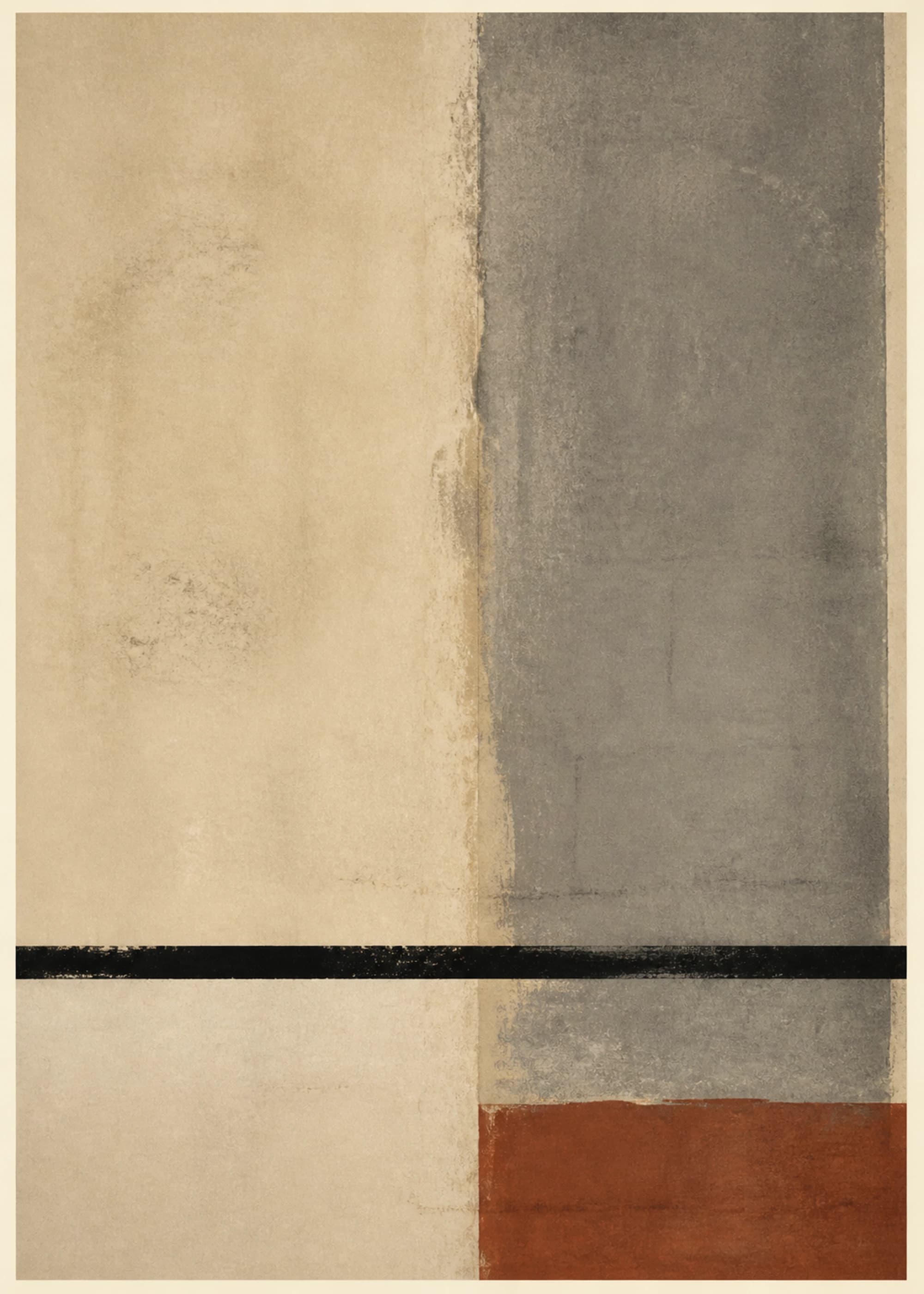
An artwork can picture rough paper grain, dry brush, woven fibers, ink drag, registration shifts, scratches, or a deckled-looking edge. Those marks are part of the image file. Giclée printing reproduces their color and shape on the receiving sheet; it does not turn a smooth sheet into the material pictured in the artwork.
PosterBloom records visual-technique language and physical production separately for this reason. “Linocut-influenced” or “paper grain” helps you read the image. “200 gsm Enhanced Matte Art paper, smooth matte, natural white” tells you what the physical support is.
A five-part paper checklist
- 1. Find the named stock. A specific paper name is more useful than “premium.”
- 2. Separate weight and thickness. Treat gsm as grammage unless thickness is also stated.
- 3. Read surface and tone. Smooth, textured, matte, gloss, bright white, and natural white are different controls.
- 4. Check the ink process. Paper and ink form a system; neither specification stands alone.
- 5. Ignore unsupported lifespan math. Display and storage conditions matter, and a retail adjective is not a conservation test result.
Keep exploring
Sources and further reading
Technical claims in this guide are grounded in the manufacturer, standards, museum, and conservation sources below. PosterBloom product details describe our current active catalog configuration.