Choosing art guide
How to Build a Coherent Art Collection
Build a coherent art collection around a clear thesis, repeated visual relationships, and controlled contrast—then test each work for individual strength and contribution to the whole.
PosterBloom guide · 9 min read · Updated Jul 14, 2026
The useful version
A coherent collection repeats a few decisions without repeating the same image. Choose one primary visual thread—palette, line, shape, subject, process language, or mood—then let scale, density, and composition vary. Buy the strongest individual works that support that thread, and leave room for one piece that creates useful tension.
Coherence is a relationship, not a matching set
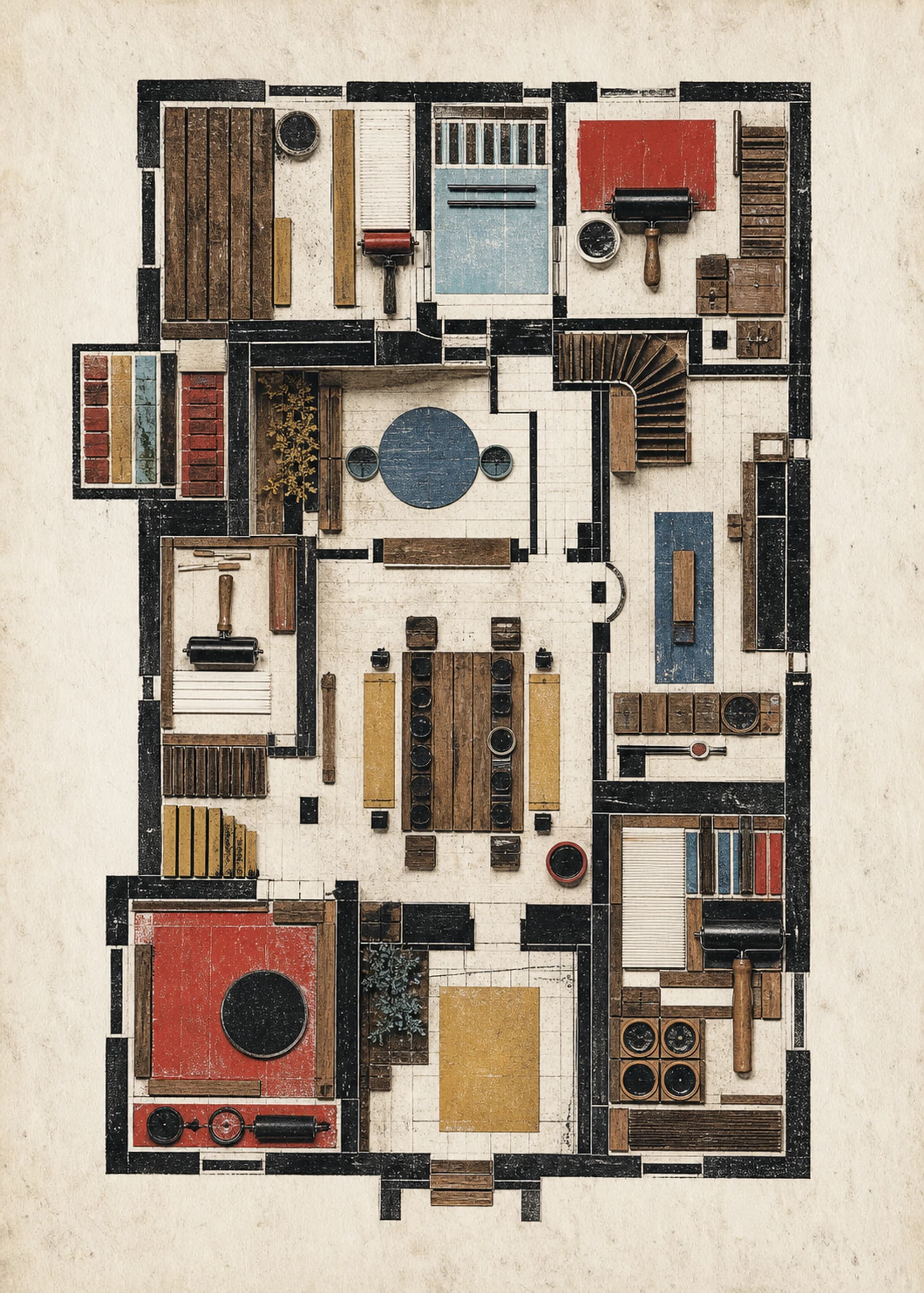
A room becomes coherent when the works give you reasons to move your attention between them. The connection might be a repeated cobalt accent, a family of rough printed edges, related geometric systems, or a shared quiet mood. The pieces do not need identical palettes, frame colors, dimensions, or subjects.
Start by looking closely. The Getty Museum's formal-analysis framework examines line, shape, form, space, color, and texture before moving into interpretation. Those visible elements are more dependable collection tools than a broad retail label such as “modern” because you can point to the actual relationship between two works.
Choose one primary thread and two supporting threads
Primary thread
The clearest repeat: a palette family, subject, geometry, mark-making language, or emotional register.
Supporting thread
A quieter relationship such as repeated paper-like texture, warm neutrals, black structure, or organic contour.
Variable
The dimension allowed to change—scale, density, orientation, subject, contrast, or compositional energy.
For example, three prints can share warm off-white paper tones and visible print grain while moving from abstraction to architecture to a recognizable object. Another group can repeat hard black structure while allowing blue, green, and terracotta accents to change. Naming the primary thread prevents the collection from becoming either random or mechanically matched.
Use an anchor, a bridge, and a tension piece
- 1. Anchor. Begin with the work you would keep even if the collection stopped there. It establishes the strongest palette, subject, or visual logic and should suit the wall where the group will begin.
- 2. Bridge. Add a work that repeats two anchor qualities but changes a third. It may carry the same blue and black while shifting from geometry to landscape, or keep the same quiet density while changing color.
- 3. Tension. Choose one work that breaks a rule deliberately: a brighter accent, more open negative space, a figurative subject, or a denser edge. It should still share at least one visible thread with the group.
This anchor-bridge-tension model is PosterBloom's practical collection framework, not a museum rule. Its purpose is to make the reason for each purchase explicit before a room fills with works that are individually appealing but unrelated.
Build with real comparisons, not abstract mood boards
Start with Quiet Load Bearing as a restrained warm-neutral anchor, then compare Ochre Stone. Both use weight, space, and earth-toned structure, but they do not duplicate the same composition. One can anchor while the other strengthens the shared material mood.
For a more graphic system, compare Optical Systems Column with HomePort. Repeated geometry and dark structure create a relationship while scale, rhythm, and accent color keep the pair from becoming a duplicated set.
Let the room constrain the collection without dictating it
- Measure first. Record the usable wall width, furniture width, nearby doors and switches, and the outside dimensions of framed objects—not only nominal paper sizes.
- Repeat one room material. A natural frame can echo pale wood; black can connect to window profiles, lighting, or hardware. Exact furniture matching is not required.
- Check value before hue. A group of equally dark works can become visually heavy even when every color technically coordinates. Mix open and dense pieces.
- Plan the gaps as part of the work. Consistent spacing can unify different images; cramped gaps can make even a deliberate collection look accidental.
Use the wall-art size calculator for nominal print proportions, then confirm finished frame dimensions before drilling. For a three-piece layout, continue to arranging a set of three.
Record what you bought, not only why you liked it
A useful collection record includes the title, maker or publisher, image source, physical medium, paper and production details, edition status, purchase date, and any known ownership history. A personal record can be modest in scope; its value comes from separating documented facts from assumptions and keeping those facts with the object over time.
PosterBloom prints are open editions produced to order. A product's visual influences, AI-assisted image origin, giclée production, and edition status answer different questions. Keep the order confirmation and product information rather than treating a style label or simulated printmaking texture as provenance.
A five-question test before adding the next work
- 1. Is it strong alone? Cohesion cannot rescue a work you do not want to keep looking at.
- 2. Which visible thread does it repeat? Name the color, line, form, texture, subject, or mood rather than saying only that it “goes.”
- 3. What does it change? The new work should add scale, energy, subject, density, or contrast instead of duplicating an existing role.
- 4. Does the wall have room? Confirm the framed footprint and spacing before purchase.
- 5. Can you describe its origin accurately? Check maker, process, edition, and provenance claims independently of the visual style.
If a work passes only the matching test, leave it out. A coherent collection should sharpen your taste over time, not turn every wall into one repeated colorway.
Keep exploring
Sources and further reading
This collection framework is PosterBloom's practical editorial guidance. The sources below provide further background on formal analysis.