Styling notes
How to Mix Abstract and Botanical Wall Art Without a Matching Set
Build a cohesive mix of abstract and botanical prints by connecting color, visual weight, spacing, and frames, with three practical pairing recipes.
PosterBloom Editorial · · 4 min read
Three pairing recipes to try
These are editorial starting points rather than named art movements or fixed design rules. Compare the actual images side by side; a style label alone cannot tell you how two prints will behave together.
| Pairing | The connecting element | Keep an eye on |
|---|---|---|
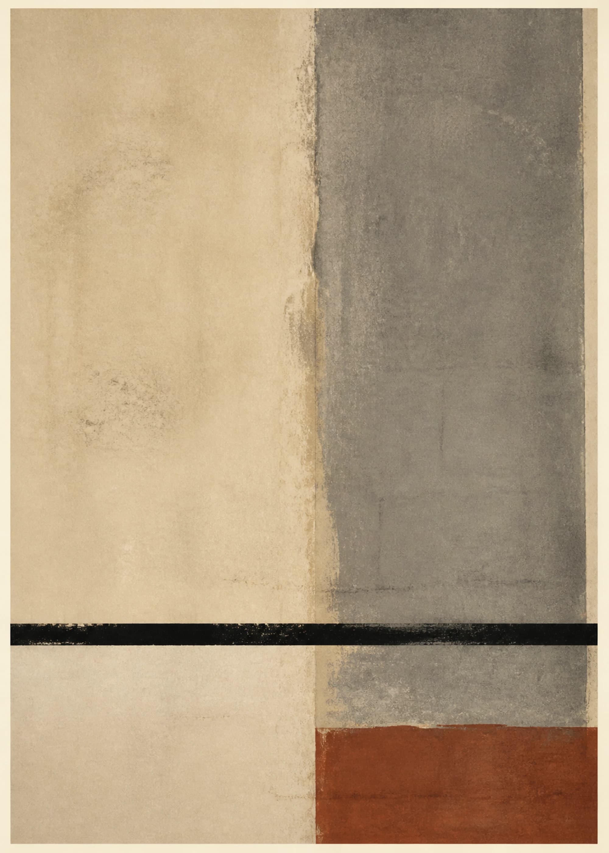
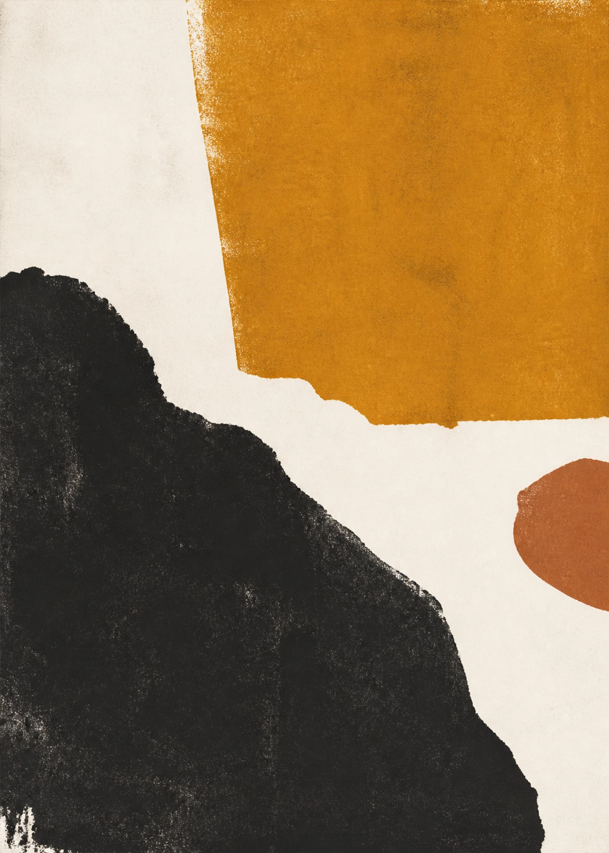
| Warm abstract + earthy botanical | Ochre, brown, or a warm background | Different whites that clash under your lighting |
| Graphic abstract + spare botanical | Dark lines and generous open space | One image looking much heavier than the other |
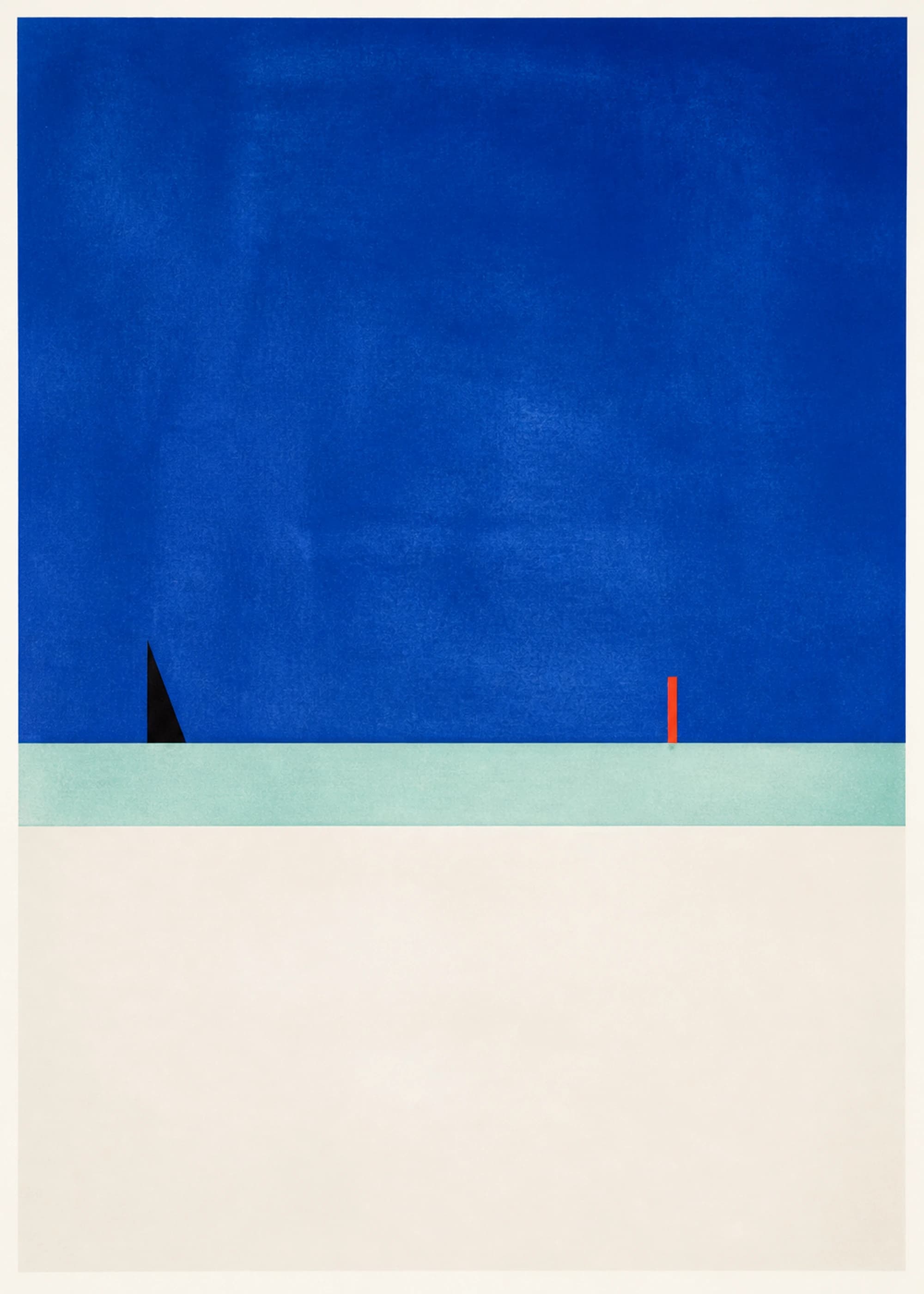
| Colorful abstract + quiet botanical | One small accent repeated in both | Too many equally strong competing colors |
Balance visual weight before physical size
Two equally sized prints can feel very different. A dark, densely filled image tends to attract attention differently from a pale image with a single stem. Place the stronger image where you want the focal point, then decide whether the quieter one supports it or disappears beside it.
If the contrast is too strong, try a different botanical print with a little more dark detail, or an abstract with more open space. You can also separate the works across a room instead of hanging them as a tight pair. A relationship can be visible from one wall to another; it does not require side-by-side placement.
Use frames and spacing to connect the pair
A shared frame finish is a simple way to connect different subjects. Matching frames leave the difference between the images visible while giving the arrangement a consistent edge. If you prefer mixed frames, repeat another feature, such as a similar mat width or aligned top edges.
Lay the framed dimensions out on the floor or make paper templates before hanging. Measure the empty space between the outside edges, not between the printed images. Look for a gap that makes the pair read as a group without squeezing them together; test it from the normal viewing distance.
- Pick the lead artwork first.
- Find one color, shape, or mark that a second print can echo.
- Compare both images at roughly their intended display sizes.
- Test the frame finish and total arrangement width.
- Remove a third piece if it adds variety but weakens the connection.
Avoid choosing by theme alone
A leaf image is not automatically calm, and an abstract print is not automatically bold. Both can be delicate, dense, graphic, or colorful. Judge what is visible in the image rather than what its category suggests.
Finally, check the pair against your room. A combination that works on a white screen may compete with a strongly patterned wall or rug. Bring the room’s dominant colors into the decision, and compare the images under the lighting where they will hang. Product photography and screens are useful references, but they cannot promise an exact color match.
Common questions
Can I mix different art styles on one wall?
Yes. Give the arrangement a visible connection through color, mark-making, frame finish, or spacing. You do not need every element to match.
Do botanical prints only suit traditional rooms?
No. Botanical subjects can be rendered as spare lines, bold shapes, or detailed images. Choose the treatment that fits the room, rather than deciding from the subject alone.