Room ideas
Wall Art for Small Living Rooms: Make One Wall Work Harder
Choose wall art for a small living room with practical advice on focal points, print scale, color, and layouts that leave room to breathe.
PosterBloom Editorial · · 4 min read
Choose the wall before choosing the print
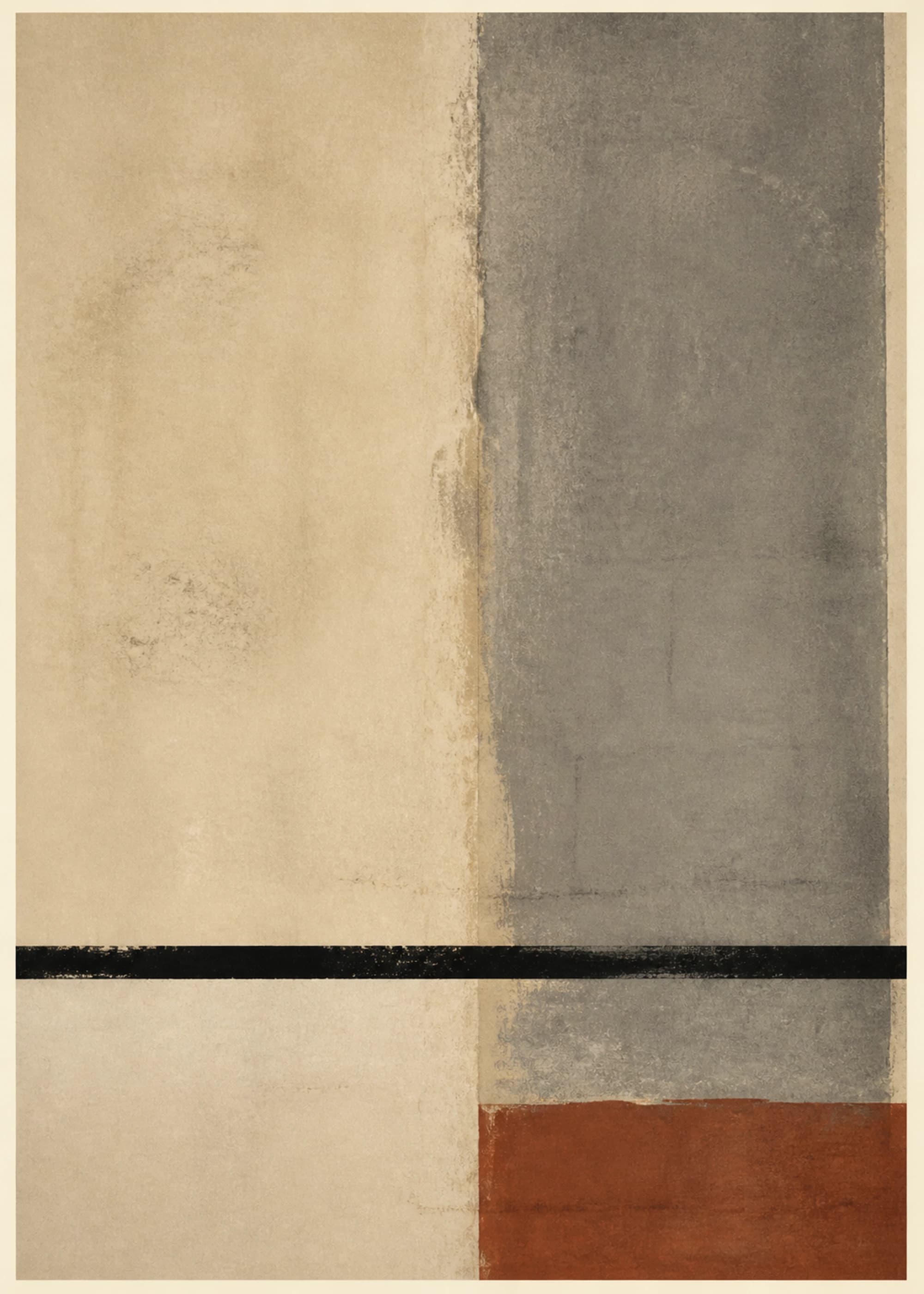
Stand at the entrance to your living room and notice where your eyes land. A sofa wall, a wall beside a reading chair, or the space over a low cabinet can each anchor the room. Pick the one that is visible and relatively uninterrupted. A wall cut up by doors, switches, and shelves may be a poor place for your main composition.
Small-room decorating is a problem of competing information. If the bookcase already holds colorful books and objects, the adjacent wall does not need an equally busy arrangement. Leave some wall empty so the print you choose has a clear role. This is a styling approach, not a rule that every small room must be minimalist.
One print, a pair, or a gallery wall?
Choose the layout around the shape of the usable wall and the furniture below it. Compare the total outside dimensions of frames, including the gaps between them. Print dimensions alone can underestimate the space an arrangement needs.
| Layout | A useful fit | What to check |
|---|---|---|
| One larger print | A sofa wall with a clear focal point | Outside frame size and space around lamps |
| A coordinated pair | A wider wall or a low console | Combined width, including the gap |
| A compact gallery wall | A personal mix of art and photographs | A shared outer boundary and consistent spacing |
| One vertical print | A narrow wall beside a chair | Door swing and visual balance from the entrance |
Test the scale with paper before buying
A print that looks substantial on a product page can look small above a sofa. Measure the furniture, then make paper templates using the actual outside frame dimensions you are considering. Position the templates with a surface-appropriate temporary method and view them from the doorway and your usual seat.
For example, two frames that are each 18 inches wide with a 3-inch gap occupy 39 inches altogether. That is a layout calculation, not a recommended size for every sofa. Use PosterBloom’s size calculator to compare starting points, then adjust for lamps, adjacent furniture, and the wall itself.
- Measure the usable wall and the furniture beneath it.
- Check the full framed dimensions of each candidate.
- Try one large outline and a pair of smaller outlines.
- Photograph both from the same spot and compare the overall balance.
Choose color and detail for the room you already have
Repeat one existing color from a rug, cushion, or chair if you want the artwork to feel connected. The print does not need to match every object. A quiet room can carry a strong accent; a patterned room may benefit from a print with larger areas of open space.
Consider how far away you will normally see the art. Broad shapes and a clear contrast can read from across a room, while fine marks reward a closer seat. Neither is inherently better. Choose detail that remains enjoyable from the actual viewing distance, rather than from a cropped image on your phone.
Finish one arrangement before adding another
Live with the first arrangement for a few days. Look at it in daylight and under your evening lamps. If it feels lost, reconsider scale or placement before buying extra pieces. If the room feels crowded, remove a nearby decorative object and compare the result.
Before ordering, confirm the chosen print’s available sizes, frame options, and the final total on the product page. Keep the remaining walls as a deliberate part of the composition. A small living room can feel personal without every wall carrying a separate statement.
Common questions
Can large wall art work in a small living room?
Yes. A single large composition can create a clear focal point. Check its outside frame dimensions against the furniture and wall with a full-size paper template before buying.
Should all the frames in a small room match?
They do not have to. Repeating a frame finish is an easy way to connect different images, but a deliberate mix can work if another element, such as spacing or color, stays consistent.